Talentum: Branding

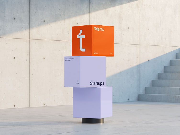
Talentum is the place where brands and talents meet each other in the most convenient way. The platform allows projects to onboard skillful and passionate contributors and manage their communities. Engineers, developers, designers, and other creators get an opportunity to contribute to top projects, improve skills by performing tasks, earn rewards, and collaborate with other talents and teams.
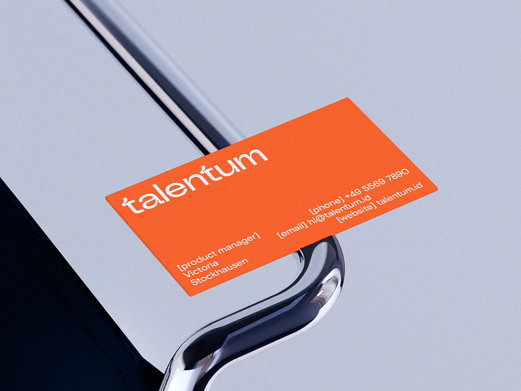
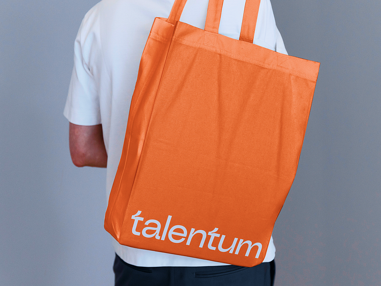
The logo starts with a small letter “t” not the capital one just to show the democracy and equity within communities that are being created on the platform.
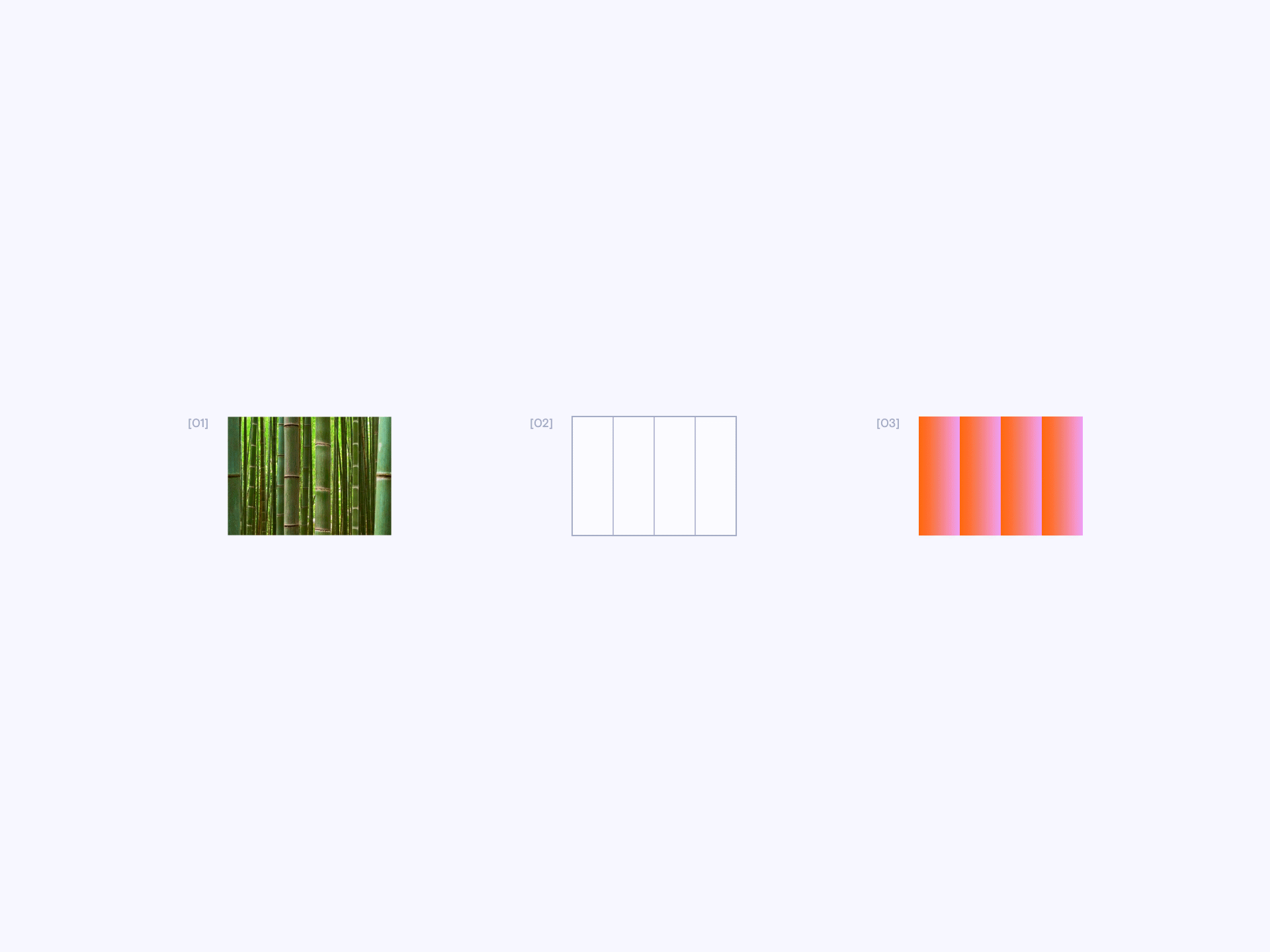
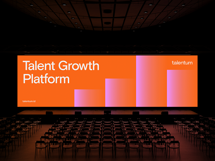
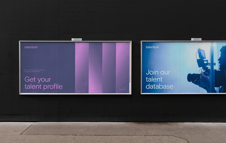
“We started with a Bamboo grove as a visual metaphor for collaborative growth. And we added transparent gradients that emphasize the transparency of the platform's relationship with users.” - Slava Mishakov (head of design in Accuraten) says.
Bamboo is quite a popular image in brand identity. It is often used as a symbol of business growth. But we managed to find a very unconventional form - Gradient rhythmic compositions.
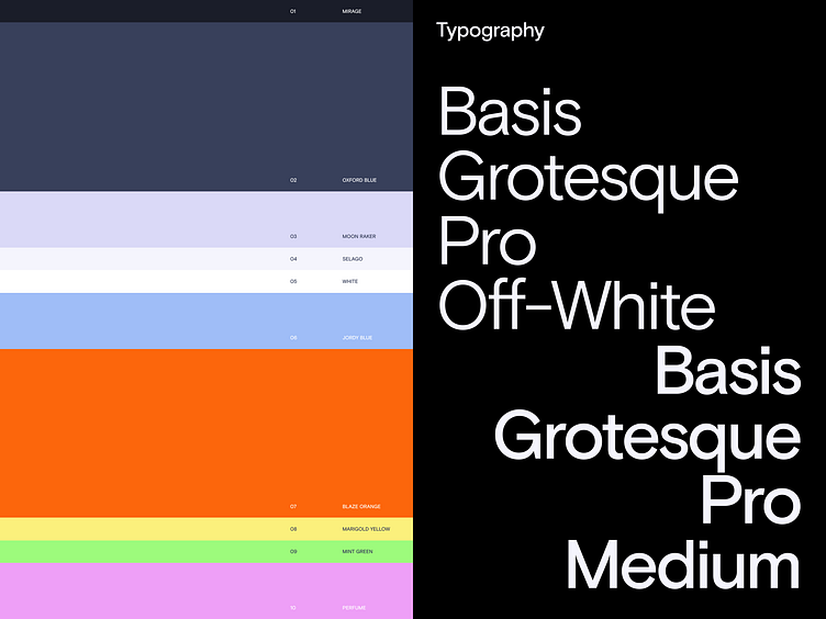
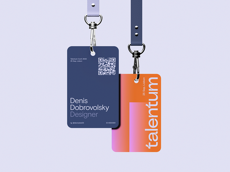
Guided by the brand's strategic vision we designated Oxford Blue and MoonRaker as our primary background colors. Other hues complement typography and design elements, while our dynamic Blaze Orange serves as a vibrant highlight, strategically placed for CTAs and areas of interest.
Basic Grotesque Pro is our only typeface that is used in two weights - Off-White and Medium for titles and other information, respectively.
Join Talentum!
A lot of design jobs from bold brands are waiting for you there!
The full case study is available on Behance.
For more works visit our website.
Use this email to contact us mail@accuraten.com


