POS waiter app

Overview
This is a mobile app for facilitating and streamlining the process of taking orders. The end user is the waiter, who can take orders directly at the table using the app, which sends the order to the kitchen or bar for preparation. This presentation covers only the waiter’s UI side and not any admin side (editing menu/tables map etc).
My role
In this project I was in charge of all the design aspects. Everything presented here was executed entirely by me (UX Research, UX Design, UI Design).
Understanding the users
The first step in my design process is to set the right initial questions in order to gain a deep understanding of the users and their needs. Answering these questions, required some online research, and some interviews/questionnaires with professional waiters and restaurant managers.
The project’s key questions:
What is the process of taking an order in a restaurant?
What are the difficulties on a waiter’s job?
What are the difficulties on the job of a chef / kitchen staff?
What are the things that can usually go wrong in the pipeline from taking an order until serving?
How do restaurants currently manage orders? What tools do they use?
Which are the most popular competitor apps?
How do current order-management apps help with taking an order?
What are the weaknesses of current apps?
What device size is mostly convenient for a waiter to use?
Is the app used on a personal or public device? (e.g. the waiter’s personal phone or a tablet owned by the business)
Defining App features
According to the findings of the above UX Research steps, I summarized the main objectives-features of the app as follows:
Creating an order by adding/removing menu items and assigning it to a specific table.
Modifying a dish of an open order by setting its parameters.
Duplicating a dish of the order (as guests of the same table often have similar preferences).
Free text note option for each order in case there is a special request.
Sending an order to the kitchen for preparation.
Overview of all current pending orders.
Optimized UI for mobile devices.
Quick access to the ordering functionality.
Information Architecture
The core purpose of the app, which is the creation of an order, can be reduced to three generic steps:
Select table
Manage order
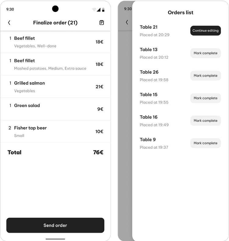
Finalize order
The user should be able to go through this flow, while having access at any time, to the list of orders that have already been placed. Going into more detail, these steps can be broken down into the views described in the flow diagram below. Most of the functionality is within the order management step.

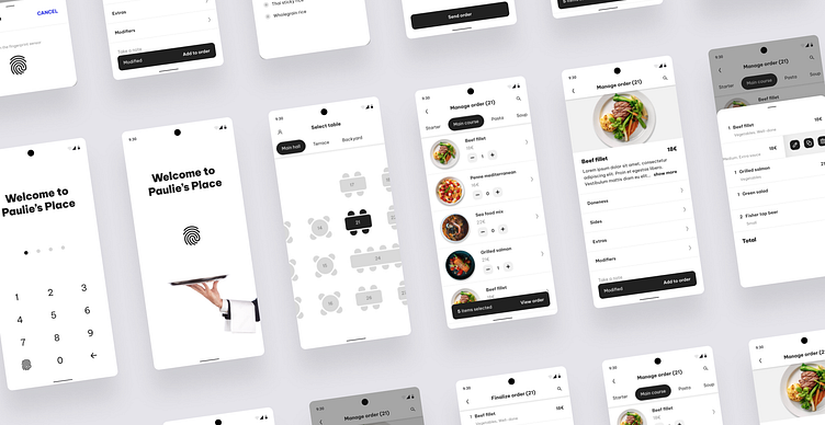
Wireframing
With the app’s structure defined, I created some low-fidelity wireframes of the main views, to outline the layout and basic functionality of the UI. I ended up to a wizard approach because I wanted the steps to be fast and straightforward. I didn’t want to have the user go through menus in order to find each action, while having to take the order from the customer at the same time.
Step 1: Select table
Tables can be selected by tapping on any of them on a top view diagram of the restaurant’s hall. I chose this visual way of selection as the most intuitive one.
Step 2: Manage order
When the order is ready, the user can tap on “View order” and go to the order’s preview. From there, they can either finalize it and send it to the kitchen, or go back to the second step for further editing.Finally, the orders list side menu will be available at all times. All the previously placed orders that haven’t been served and payed yet will be shown there.
Step 3: Finalize order
When the order is ready, the user can tap on “View order” and go to the order’s preview. From there, they can either finalize it and send it to the kitchen, or go back to the second step for further editing.Finally, the orders list side menu will be available at all times. All the previously placed orders that haven’t been served and payed yet will be shown there.


Mockups
The wireframes were eventually translated into high-fidelity mockups. Not only the visual style was created at this stage, but also a lot of functional details took their final form (e.g. the item’s parameters selectors like the sides, and the actions next to each item of the order).


Some noteworthy UI decisions
Since the app could be potentially used by any restaurant/bar of any style and branding, I chose the UI to be rather white-label, with a customized name on the splash screen and a neutral color palette.
As main CTAs, I used full width buttons that can either contain just the action text, or both the action text and a piece of information about the state (e.g. 5 items selected - View order). These helped me include more information in the limited space of a mobile screen.
On the “View order” bottom drawer I made the list items swipeable in order to reveal the action buttons (edit, duplicate, delete). This pattern again saves a lot of space and allows for a lighter UI, as there is no need for repetitive buttons.


