Riter - Logo Design ✒️

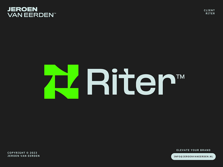
Logo Design for Riter.
The AI writing platform of top teams.
Concept
Rotating pen-heads with negative space forming letter R.
Also, the name is a fun twist of the word 'writer'.
The concept went unused. If interested, feel free to reach out.
info@jeroenvaneerden.nl
🚀
Let's work together and elevate your brand!
Feel free to reach out via Dribbble DM or E-mail.
💼 Connect with me on LinkedIn / Read my Client Recommendations
🎬 Check my YouTube for Logo Tutorials / Learn Logo Design
🔗 Follow me on Instagram / See BTS and New Content
🛒 Buy my pre-made or unused logos from the portfolio
💬 Tweet with me


