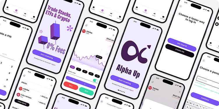
Alpha Up : Stock app

Overview
A user-forward stock trading app tailored for new investors, striking the perfect balance between simplicity and robust features. Unlike many brokers that demand in-depth exploration, this app offers a seamless experience. In today's fast-paced world, where smartphones are ubiquitous, we've designed trading to be effortless on device. By re-imagining the traditional four-screen home setup, a simple, accessible and mobile solution was created.
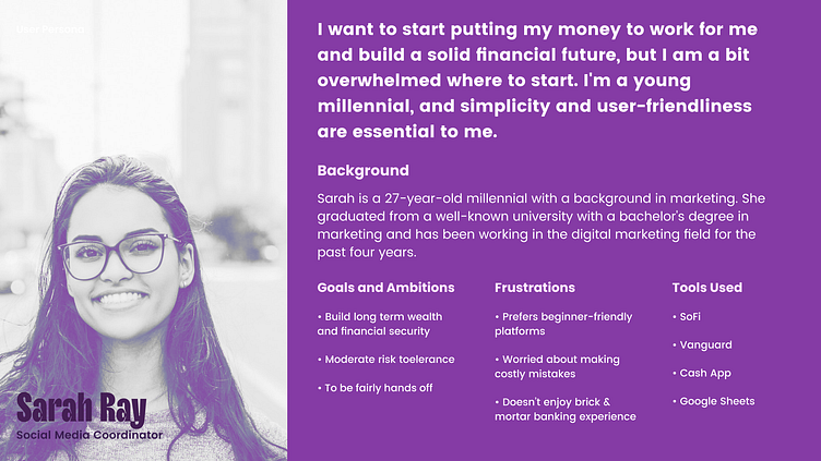
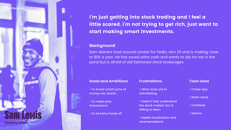
The user persona
Collected and analyzed the primary motivations and challenges expressed by users in a tech savvy cohort. To guide this process, insights from two distinct user personas were highlighted and both underscored the importance of simplicity and ease of access, an experience that did not intimidate the newbie. These personas served are key in shaping the strategy for addressing user concerns and developing the experience.
Market Research
Mobile trading apps have witnessed a remarkable surge in users over the last decade, driven by the democratization of finance, increased interest in stock and cryptocurrency markets, and easy mobile access to the market place.
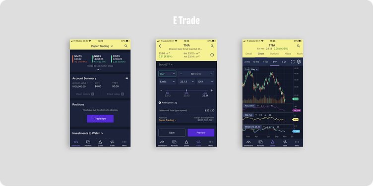
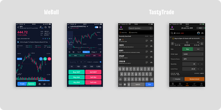
Analysis of 3 Mobile Trading Apps:
Four key insights were identified from the top 3 mobile trading apps, these insights revealed opportunities for enhancement in the broader mobile trading landscape.
Advanced Features: All three apps boast advanced features catering to traders of varying experience levels. While this comprehensive toolkit is an advantage, the associated complexity may challenge beginners.
User Interface: These apps share a common issue with their interface design, often feeling clunky and overwhelming. Striking the right balance between numerous features and user-friendliness is a significant challenge, potentially deterring those seeking a streamlined experience.
Feature Overload: Each app exhibits a tendency toward feature overload, risking user overwhelm. Prioritizing user-centric features is essential to maintain focus and avoid unnecessary complexity.
Information Overload: A common issue in all three apps is directing the user's attention to multiple areas simultaneously, leading to confusion. A more organized presentation of data and features could improve the user experience.
These findings underscore the complexity and challenges in mobile trading apps. While they offer advanced tools, addressing interface design, feature overload, and user learning curves is critical to ensuring a more accessible and satisfying experience for users, regardless of their trading expertise.
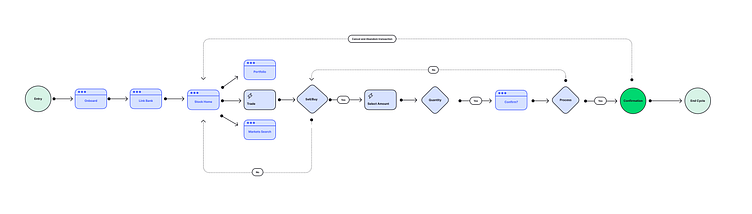
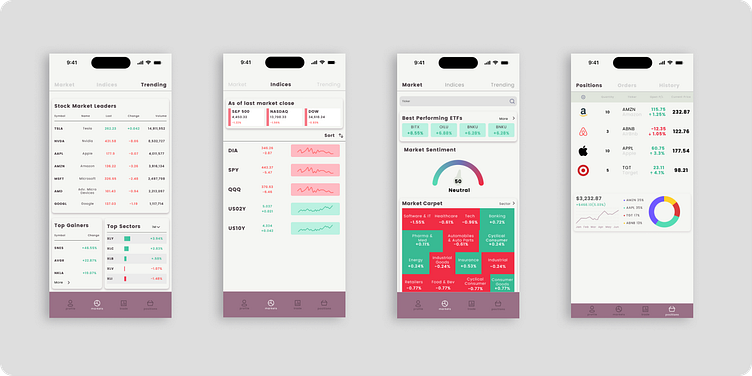
App Flow
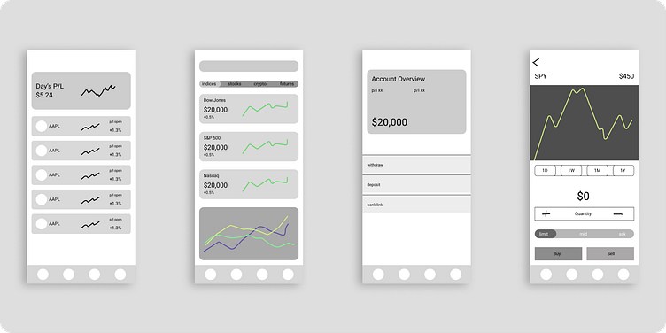
Iteration #1
In the initial designs and wire-frames, significant emphasis is placed on intricate details, incorporating feature-rich designs that aimed to encompass user purchase settings, chart views, and market scanners commonly found in major trading desktop applications. By progressing into the visual design phase too early, the design unintentionally deviated from the goal of creating a user-friendly interface that is tailored to beginner traders. The design appeared overly cluttered and the use of color failed to effectively differentiate primary elements from other secondary information displayed on screens.
Major Pivot - After version one I scratched this design and completely started fresh with new wire-frames and a new visual design language that focused on simplicity, friendliness and focus.
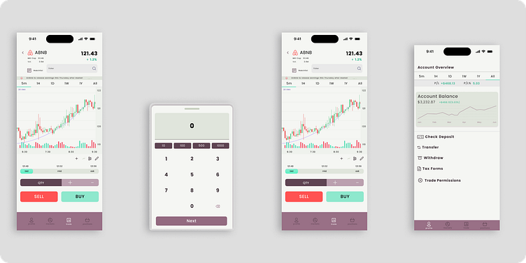

High Fidelity Wireframes
Incorporating a new design approach, higher fidelity wireframes were crafted. In these wireframes, meticulously aligned elements on a 8px grid, fine-tuned font sizes and styles. Building wireframes in this manner allowed for a seamless transition into the visual design stage. This choice proved invaluable in organizing the information more clearing prior to the visual design process.

Visual Design
Explored several color and font pairings and discovered a general mood that fit the simple yet friendly aesthetic that would create an inviting feeling. The colors and mood board convey a sophisticated, yet witty feeling that felt relevant to the finance space for differentiation in the market. TT Trailers is a contemporary font with exaggerated flare, and Poppins being the grounding classic font.
Ultimately the goal was to convey that the app was a professional stock broker but also fun and engaging.
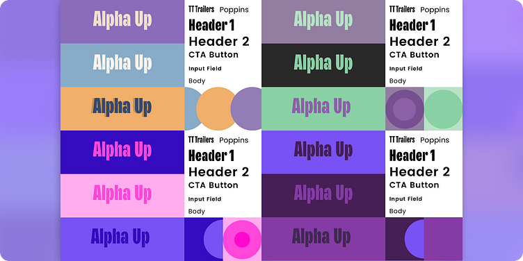
Component Library

Value
• Attain user membership with quick login & profile set up
• Quickly connect user funds with api connectivity
• Streamlined the navigation flow
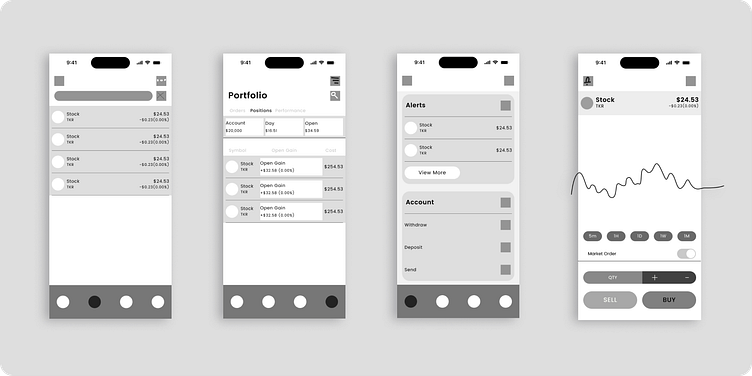
• Customizable watchlists and price alerts
• Prototype showcases the simplicity of Alpha Up
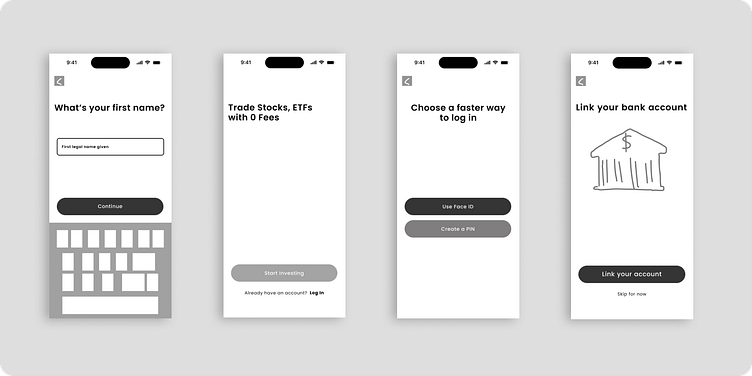
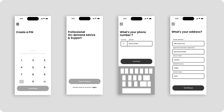
App Demo & Features
• Quick & Easy Register
• Adding Funds from Bank (API, Plaid)
• PIN/Face ID security set up
• Filter equities in Market page
• Add price alerts
• Save to custom watch lists
• Simple line charts
• Switch to Market Buy or Limit orders
Highlights
The primary objective of the redesign was to enhance user interaction and strengthen their connection with stock investing in an inviting and friendly manor.
Throughout this project, valuable insights were garnered through research and by aligning with the users' objectives. A focus on empathizing with users' frustrations played a pivotal role in the decision to revisit and refine the project.
I would greatly appreciate any feedback.


