"Paper Towns" Redesign

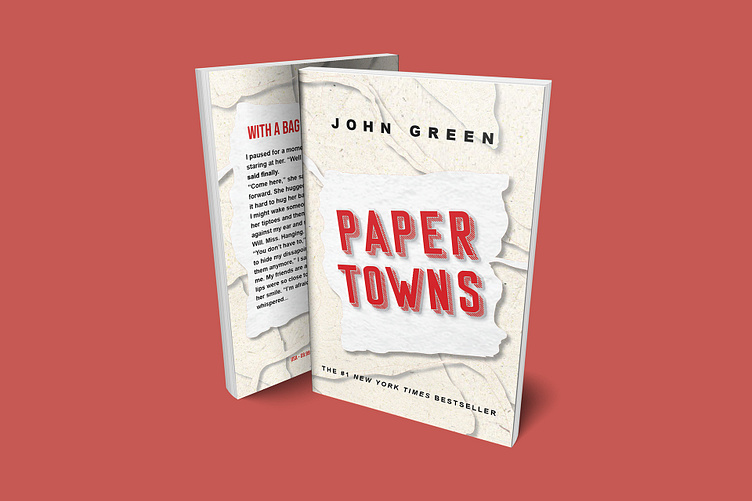
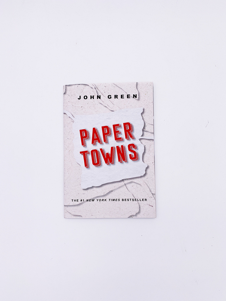
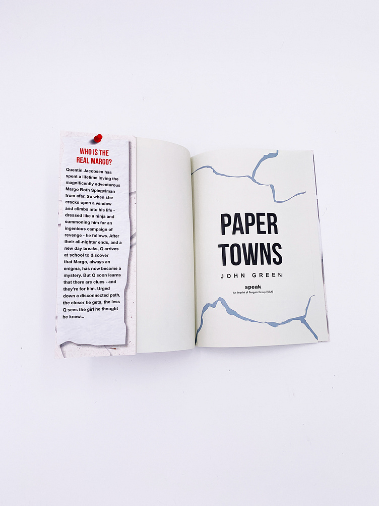
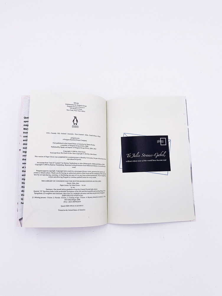
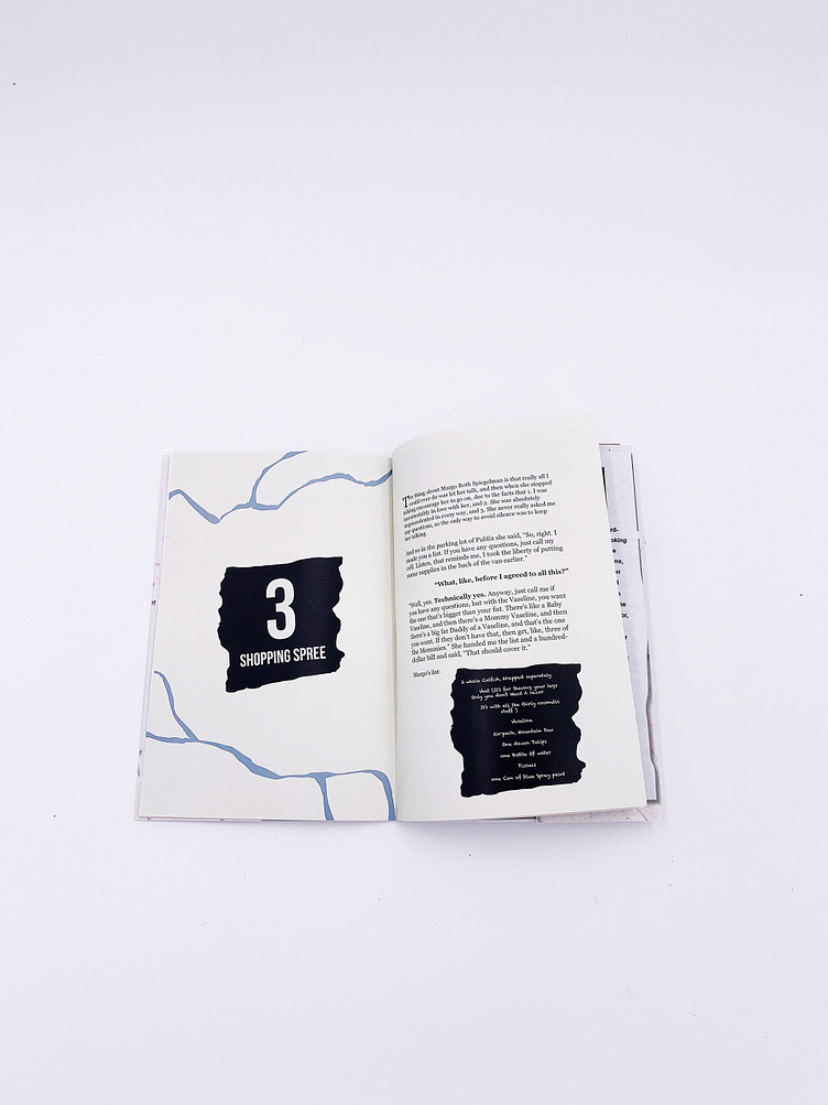
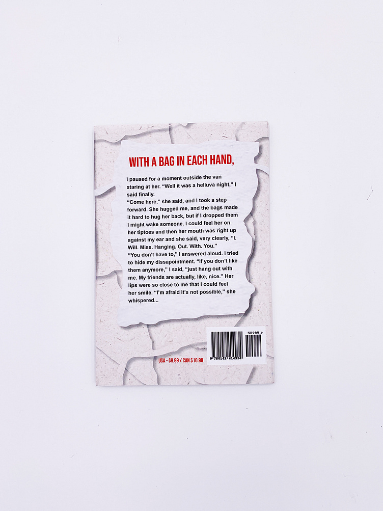
With this redesign, I wanted to capture the travel and mystery aspects through the use of map-based imagery and notes throughout the visuals on the book. Additionally, different fonts were chosen for some of the dialogue and story text to give the words even more personality and character through their own unique identities. I sketched out preliminary options for different icons and layouts, some of which I made versions of in Illustrator before deciding on the final version. The The final designs where then chosen, revised, and printed. A physical sample book was bound together and included the dust jacket created during the design process.
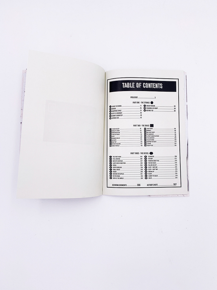
What you see below are the final designs and the physical sample book. Travel and maps were captured with the winding roads and connecting pieces throughout the book. The table of contents is also formatted to represent a map iconography key. During the story, the main characters use notes and clues to connect the dots and figure out where the missing girl went. That mystery portion is captured in the use of paper scraps, thumb tacks, and the postcard in front. This project was an added introduction to bookbinding and creation. Throughout its creation I was able to learn not only about proper layout and design, but also the process of cutting and binding it together.