29 Nights - Logo Design, Visual Identity & Website Design

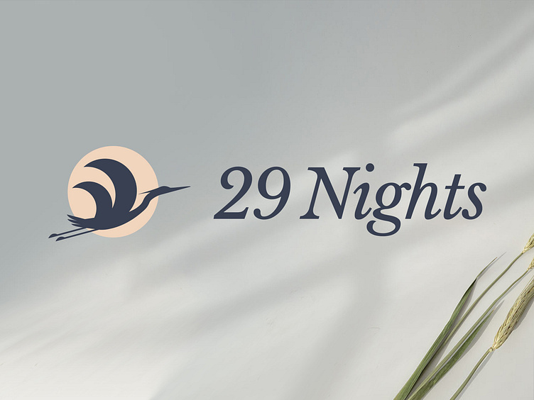
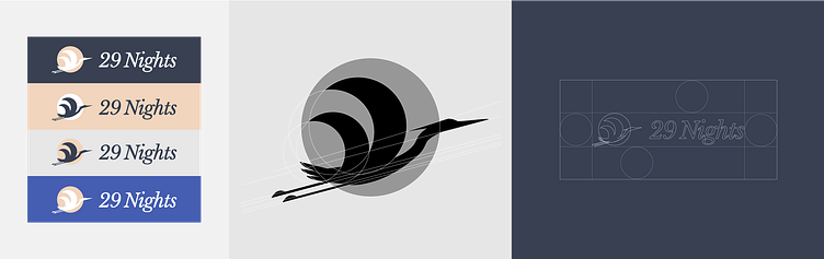
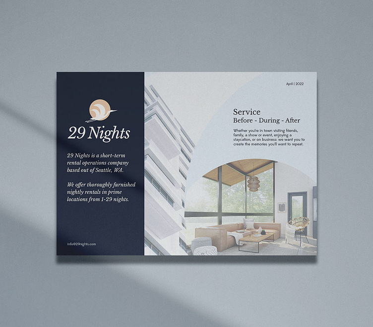
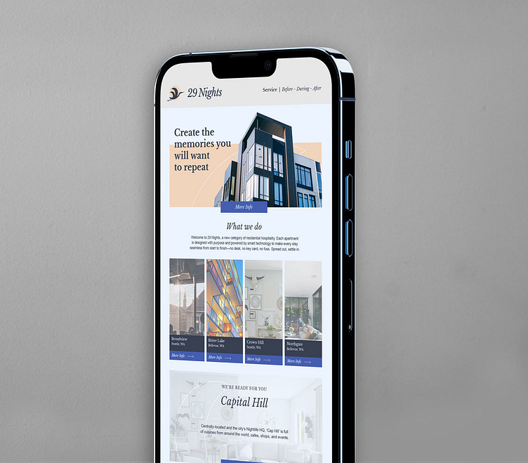
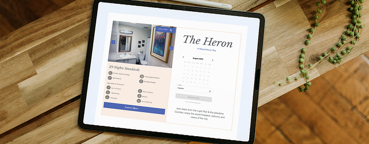
29 Nights are a rental arbitrage investment company based in Seattle, offering customer-friendly, guest-centric, and relationship-oriented stays in the region of Washington. We were responsible for building their new brand that aligned with their elegant, proud and attentive approach. The Great Blue Heron is a feature of the Seattle region throughout the year and is noticeable mainly due to its majestic wingspan. We selected this determined bird as the logo icon for its excellent vision and scouting abilities. These abilities relate to the company’s unique focus on analysing guest experience. The wide-spanning wings of the heron mimic the early phases of the moon, with a full moon in the background. This links to the before, during and after service offering, with the full-moon symbolising new beginnings and growth. We were entrusted with the design and development of their brand guidelines, website and email marketing templates.
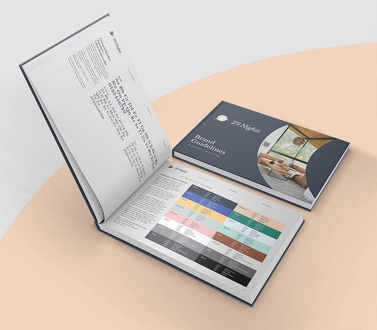

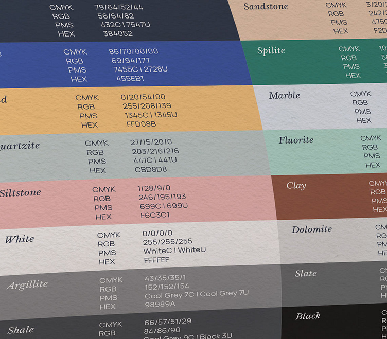
The naming of the brand’s colours link to the origins of 29 Nights, using relevant geological names from the Puget Sound region.
Work enquiries
Available for new projects. Email me directly at info@jddesigns.co.uk
Let's connect
jddesigns.co.uk


