YouTube App Recreation - A YouTube Case Study

Ever wondered how YouTube shines on a 27'' screen? Well, wonder no more! I was challenged with recreating everyone’s favorite media app for a case study and I am proud to finally show you the result. Welcome to my first case study! 🎉
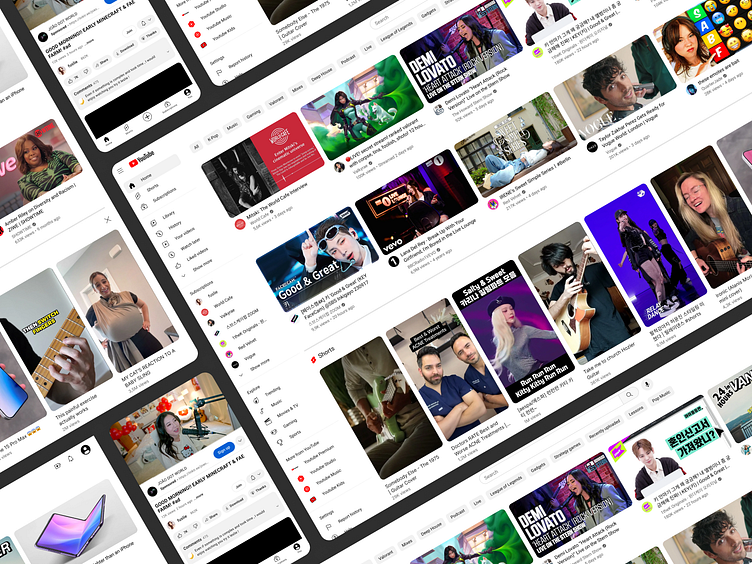
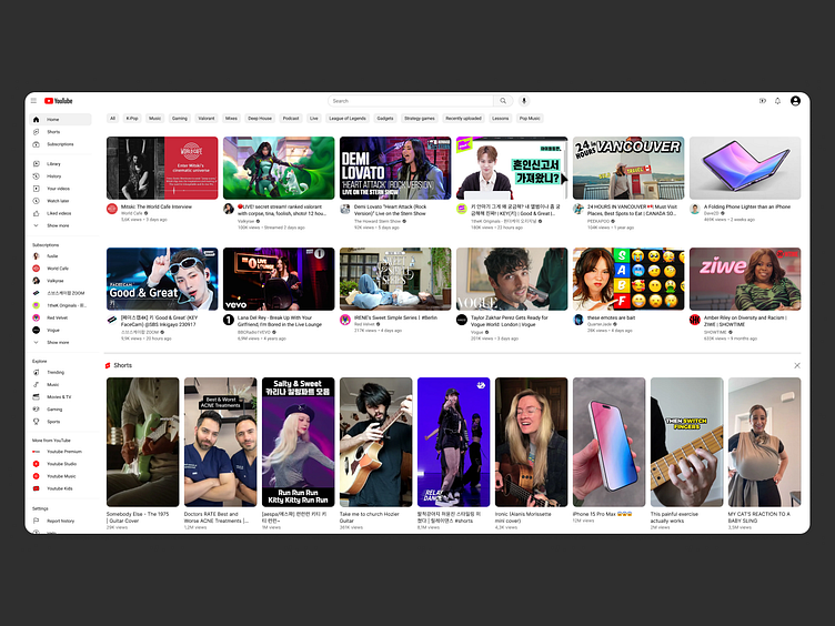
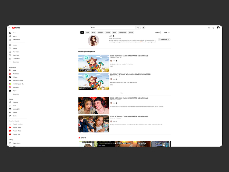
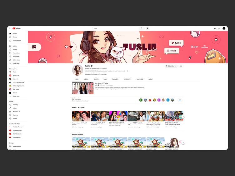
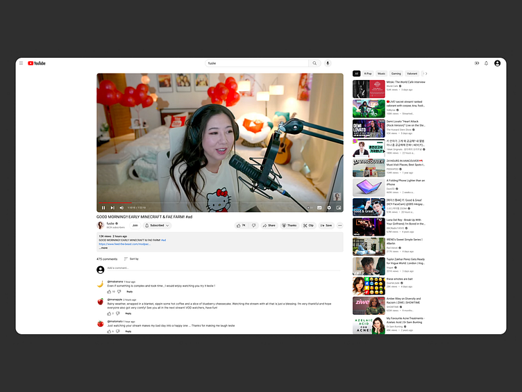
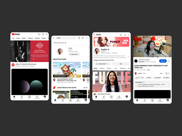
For this project I decided to recreate only a selection of important screens - home, search, profile and video — adapting the UI for both desktop and mobile.
🚦 Starting Point:
Redesign YouTube's UI for desktop and mobile.
Retain core functionalities.
Embrace YouTube's minimalist UI system.
😵💫 Challenges Faced:
Minimalist use of color: YouTube's UI has a very minimalist color scheme, primarily using white, black and a small amount of shades derived from these two. Adapting to this restrained color palette while ensuring visual coherency was a challenge, as I am not used to working under such strict systems.
Making sure spacing was accurate: the proper spacing and alignment of elements were essential for creating a visually appealing and user-friendly design.
Mobile Adaptation: adapting YouTube's UI for mobile devices presented challenges due to the need to estimate sizes by eye, unlike desktop adaptation, which could be inspected using the browser’s developer tools.
🧠 Lessons Learned:
Minimalism is fire: adapting a minimalist color scheme can be challenging but results in a clean and visually pleasing UI that focuses on content. Same goes for the app’s spacing system. Using 4px as a base unit and creating bigger blocks of space by incrementing 4px each time proved to be one of the main features that makes YouTube have such a readable and easy to navigate interface.
Monitor Size Matters: designing on a 27-inch monitor provided valuable insights into space utilization that can be beneficial for future design projects.
Figma, Figma, Figma: definitely can never get enough of learning new methods and shortcuts for this wonderful piece of software.
The YouTube UI adaptation project was a valuable experience for understanding and applying the principles of minimalist design, effective spacing, and responsive mobile design.
Apologies as during this project YouTube tested a variety of design updates, so you might notice some differences from the most recent version of the app.
Thank you. Check all my socials on https://linktr.ee/joaomiguelpratas.


