Marktplaats - Logo Redesign

Logo redesign for Marktplaats (unofficial)
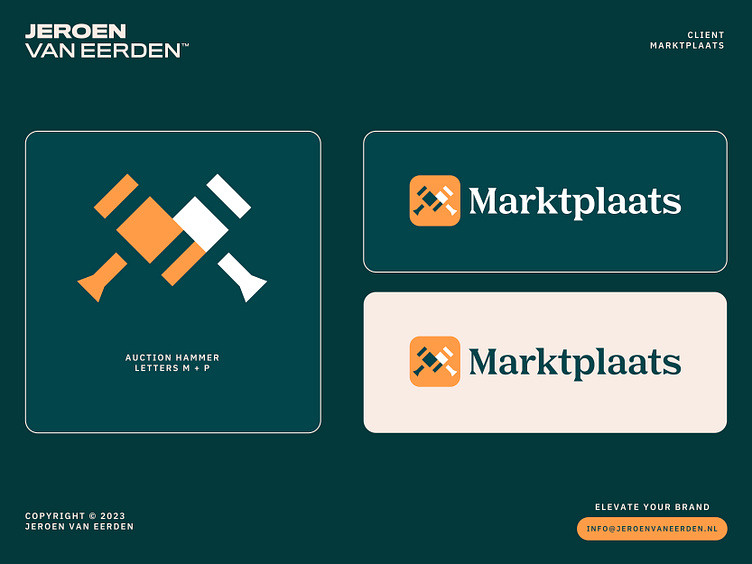
Marktplaats is the Netherlands’ favorite online source for selling or buying anything you could want, from boats and services to pets and houses.
I had this idea for a logo mark where two auction hammers form the letter M and in an abstract way, also show the letter P (if we break up the word Markt - Plaats means market-place). Always felt the current logo lacked a lot of uniqueness or meaning in general. Therefore worked on my version in my free time as a little design challenge.
Open for feedback.
info@jeroenvaneerden.nl
🚀
Let's work together and elevate your brand!
Feel free to reach out via Dribbble DM or E-mail.
💼 Connect with me on LinkedIn / Read my Client Recommendations
🎬 Check my YouTube for Logo Tutorials / Learn Logo Design
🔗 Follow me on Instagram / See BTS and New Content
🛒 Buy my pre-made or unused logos from the portfolio
💬 Tweet with me


