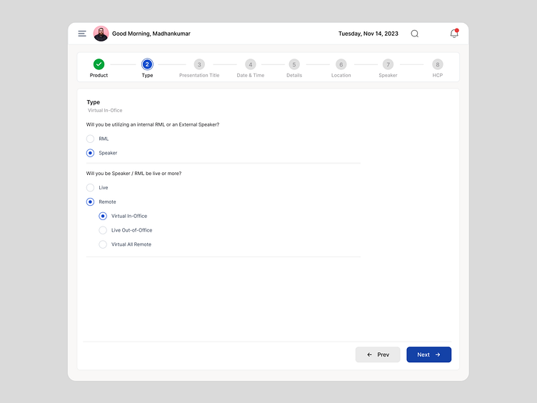
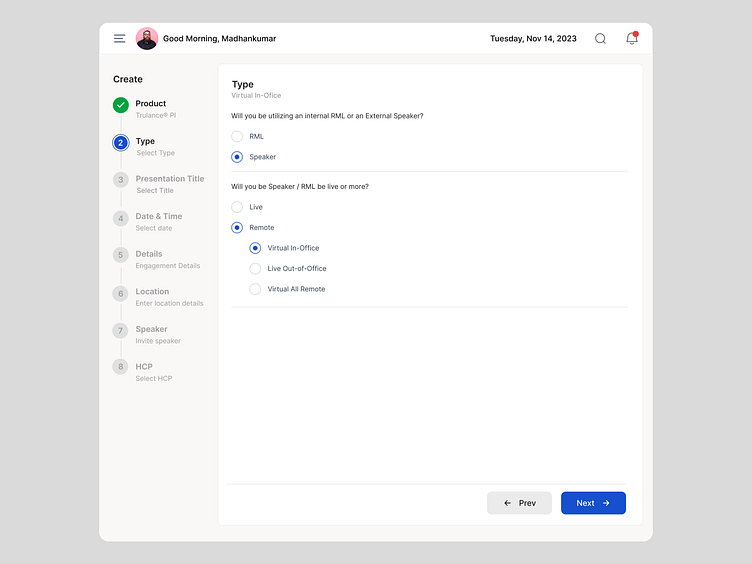
Multi Step Process UI

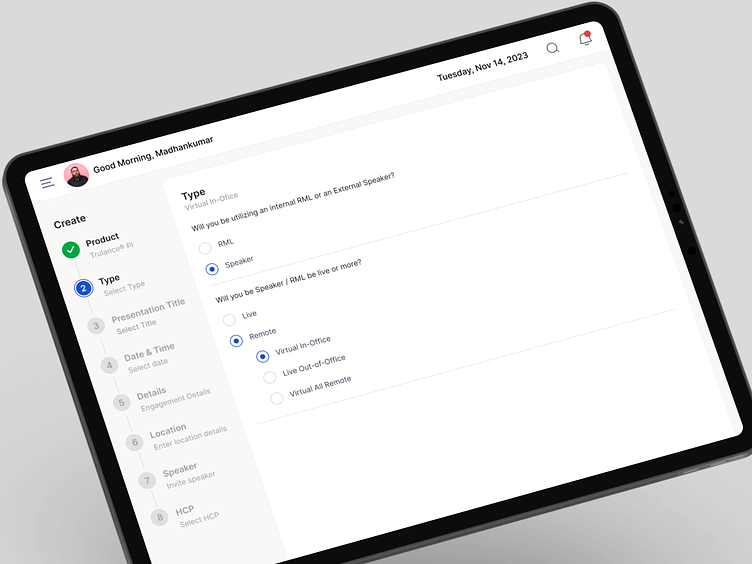
Steppers
A horizontal or vertical sequence of steps, each representing a particular action or stage in a process.
Each step may contain a number indicating its order, a title describing the action, and an icon or color indicating its status.
Horizontal
Vertical
.Stepper:
A horizontal or vertical sequence of steps, each representing a particular action or stage in a process.
Each step may contain a number indicating its order, a title describing the action, and an icon or color indicating its status.
Green Tick Mark:
Represents a completed step.
Indicates that the corresponding action or stage has been successfully accomplished.
Blue:
Represents an active or currently in-progress step.
Indicates that the user is currently at this step in the process.
Grey:
Represents a step that is yet to start or has not been initiated.
Indicates that the corresponding action or stage is pending.
Stepper Title:
A title or label associated with the entire stepper, providing an overview or description of the process.
Panel Box:
A container that holds the stepper and its associated content.
May include additional information or controls related to the current step.
Next Button:
A button that, when clicked, advances the user to the next step in the process.
Opens the associated panel box for the next step.
Hi Dribbblers 👋
If you like 💚 my work, it will be my motivation to create more projects. Press key "L" to like this post.
-----
Follow Me On Instagram: @madhanu
Connect With Me On LinkedIn: @dmadhankumar
Follow Me on Twitter: @dmadhankumarr
Find more works on: madhankumar.in
-----
Thanks for watching! Hope you guys like it!
Thanks for scrolling! 🙌


