Spiro : Meditation & Breathing App

Overview
In the ever-evolving landscape of digital wellness, Spiro emerges as a beacon of serenity, providing users with a seamless path to mindfulness and well-being. This case study explores the transformative journey of a minimally designed meditation app, offering a blend of guided meditation practices and rejuvenating breathing exercises.
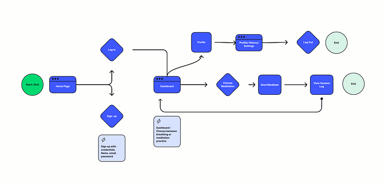
App Flow
Conceptual diagram of Spiro's user flow. Primary objective of keeping the user engaged by streamlining as much as possible.
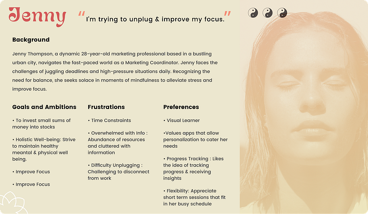
Client Profile
Spiro caters to a diverse audience, with a primary focus on users like Jenny Thompson, a 28 year old marketing professional seeking resort from the chaos of her demanding career. Spiro aims to offer a simplistic & effective digital experience, making mindfulness accessible to both beginners & seasoned practitioners.
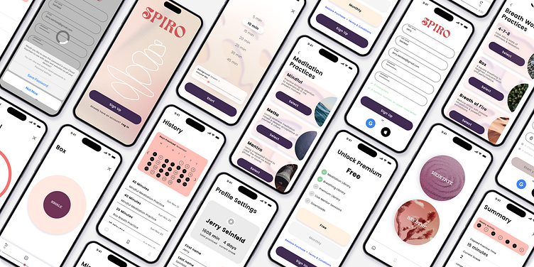
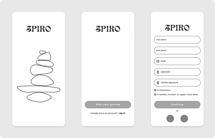
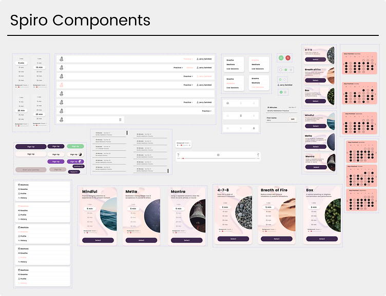
High Fidelity Wireframes
The wireframes introduced the foundational structure and skeletal framework of the app, outlining a streamlined layout designed for optimal efficiency.
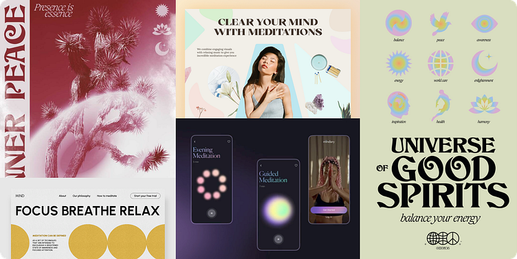
Mood board
Inspiration collage that inspired the visual exploration of Spiro.
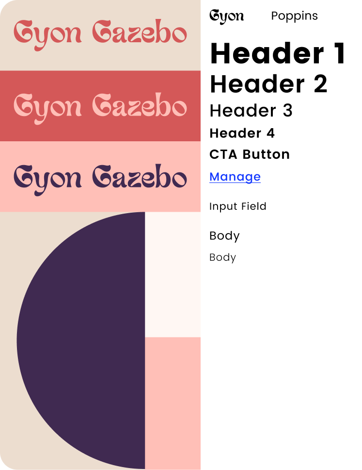
Style & Components
Guided by the inspiration drawn from the mood board, I delved into the exploration of visual styles for Spiro. My choice of typefaces centered around a clean and minimal approach, with Poppins serving as the workhorse font. This modern typeface, widely recognized in UI design, embodies clarity and legibility.
For the Spiro Header and Logo Font, I opted for Gyon Gazebo, a typeface exuding an ornate and trendy aesthetic, almost hand-drawn. It captures the essence of warmth, openness, and creativity, aligning seamlessly with the current zeitgeist.
Throughout the application, I judiciously applied a warm color palette evoking feelings of sunlight, sunset, and ease on the eyes. The dark mode iteration serves as a deliberate contrast to the standard app colors, avoiding true black and true white to soften harsh contrasts.
These selected styles act as the guiding northstar and compass for Spiro's visual design direction. Adhering to this foundational structure ensured cohesiveness throughout the app.
While the style guide provided a solid framework, occasional deviations from the norm, guided by personal judgment, injected additional character and uniqueness, all within the bounds of good taste.
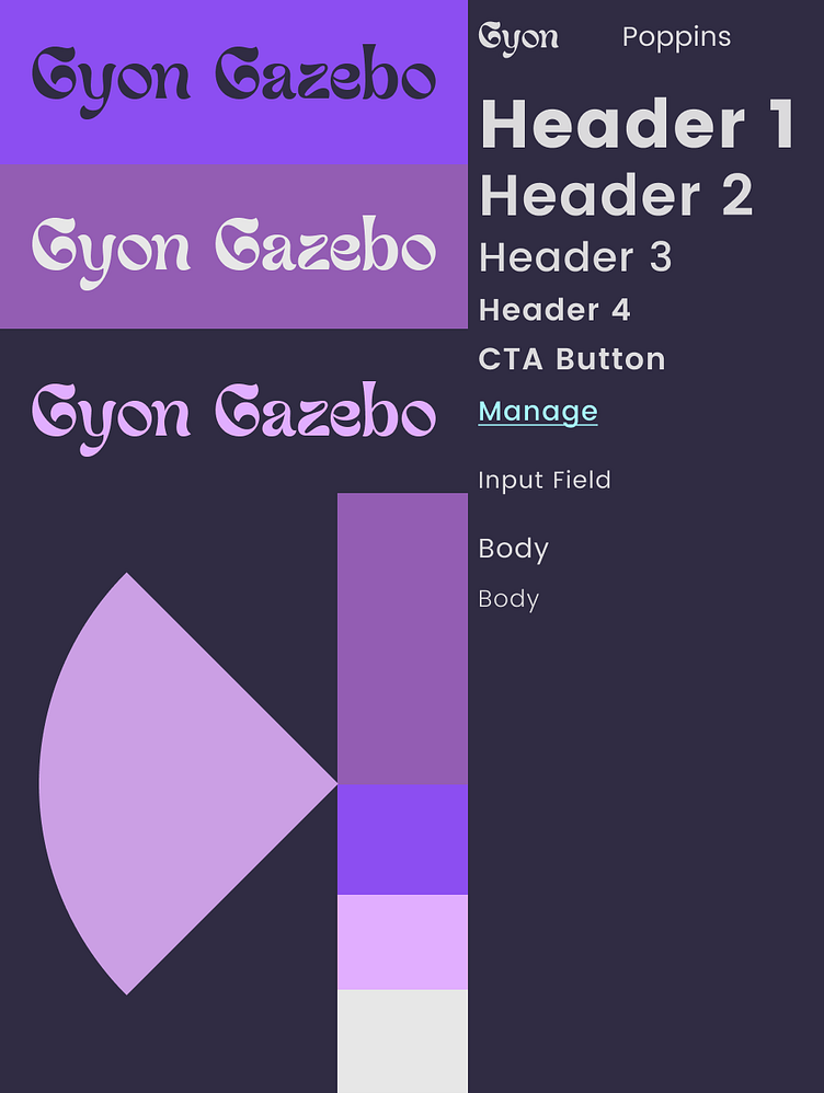
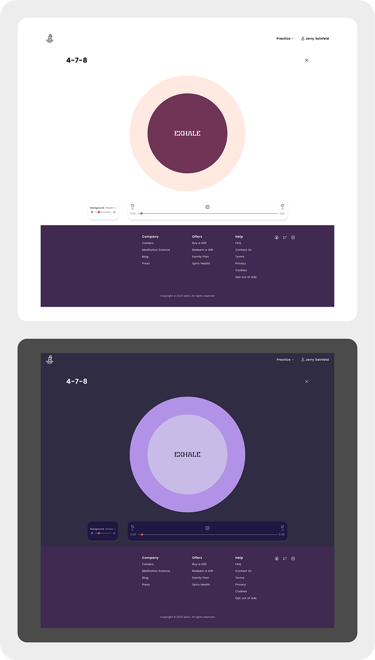
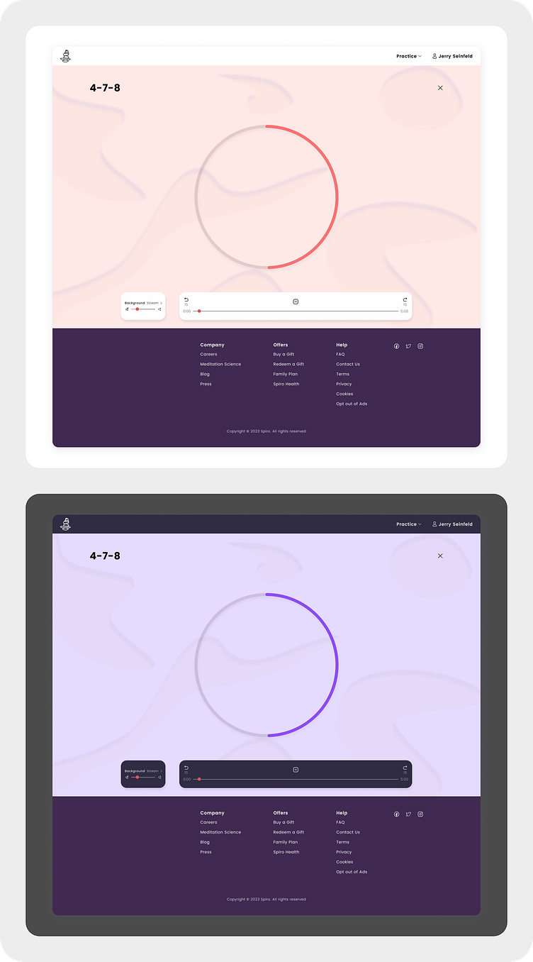
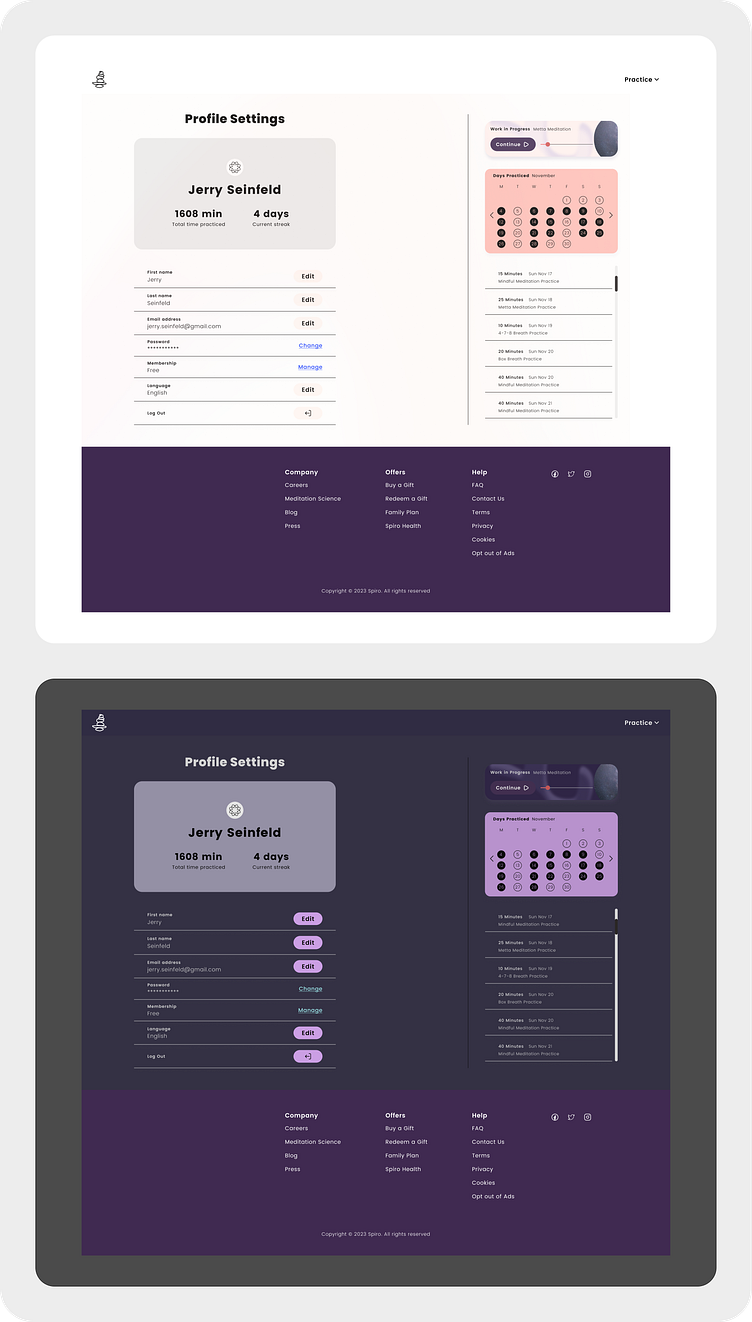
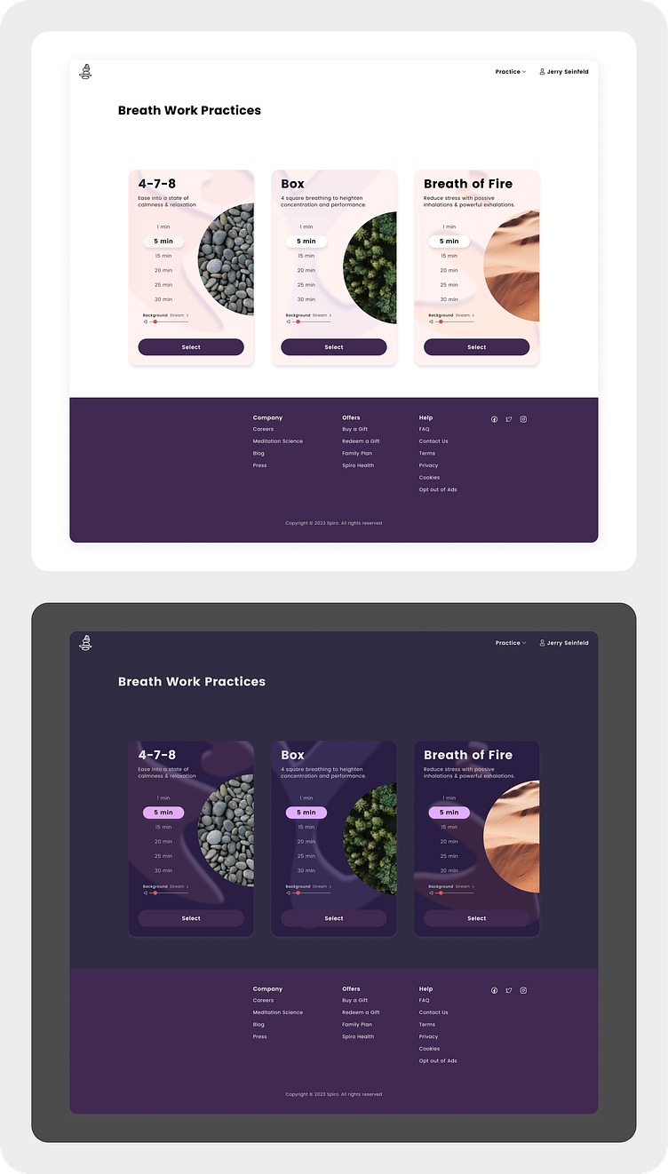
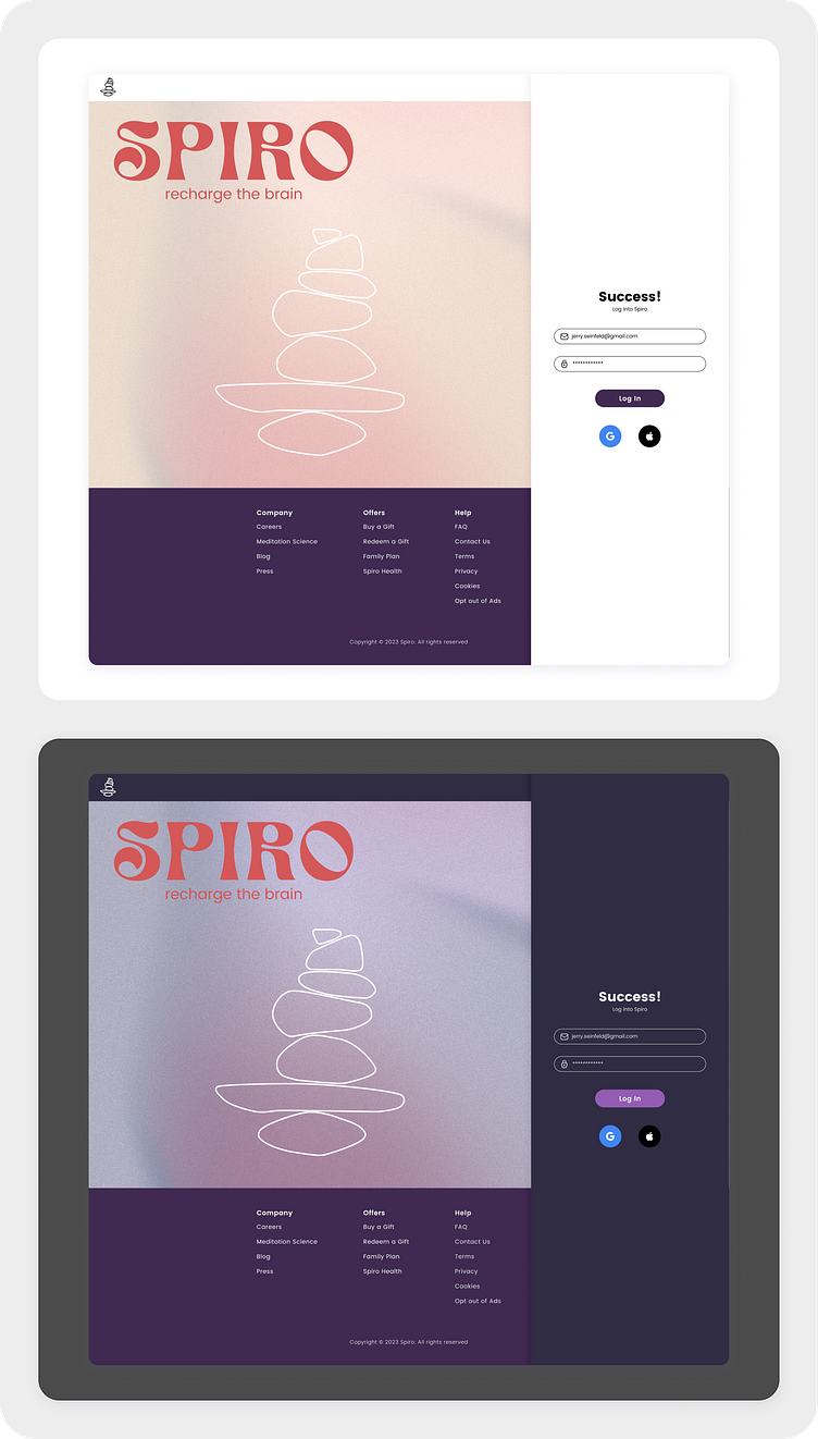
Dark Mode
Dark mode experience on the web app.
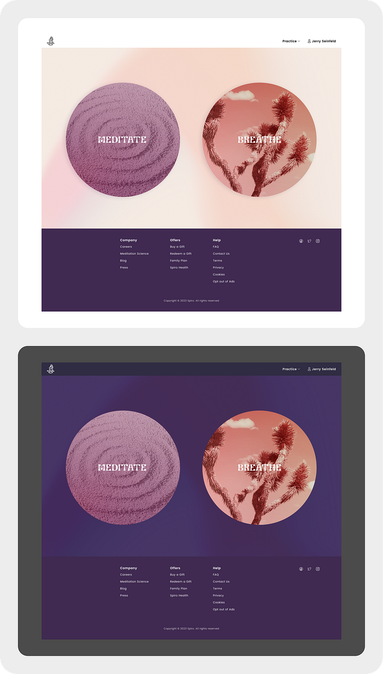
Prototype Hand off
Spiro Desktop Prototype
The Spiro digital experience for web.
Mobile Prototype
Below are short clips that take you through the experience of using Spiro.
Sign up
Meditation Session
Session Summary
Breathing Session
Profile Settings & History
Conclusion
Spiro stands as a testament to the transformative power of mindfulness & the power of breath work, proving to be the sidekick on your wellness journey. Thoughtful, user-centric design, propel users commitment for daily ritual. Spiro becomes the digital sanctuary for individuals seeking peace & balance in their lives.


