Ikea logo redesign experiment

Starting off the year 2024 with a fun experiment after getting inspired by an... Ikea knife.
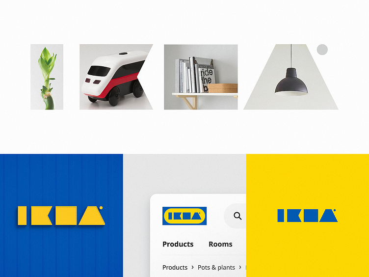
A few days ago, I glanced at the Ikea logo printed in a light gray color on the white blade of one of my Ikea knives. It occurred to me that the Ikea logo is easily recognizable even from a long distance, in a very small size, and printed with low contrast, even without being able to read the letters of the wordmark.
That immediately made me want to recreate the Ikea wordmark without using the letters, using simple geometric primitives with similar proportions.
Let me know if you can still read the brand name in these simple shapes
Contact me to get your logo design or branding project done:


