Belle Provence Brand identity


Belle Provence is an online boutique specializing in the creation of 100% natural artisanal soaps made in the South of France.
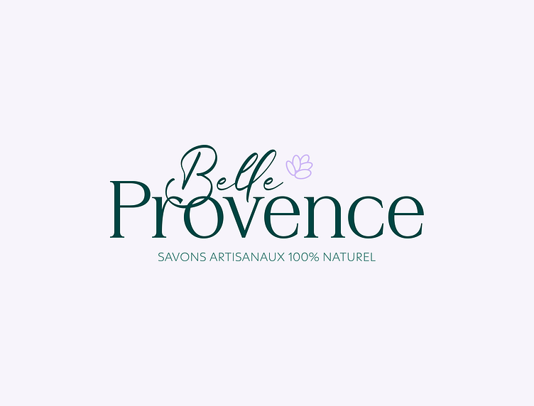
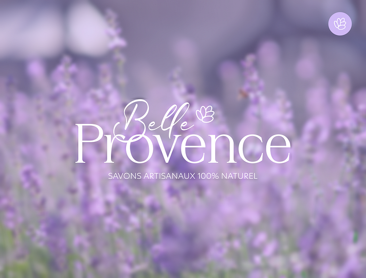
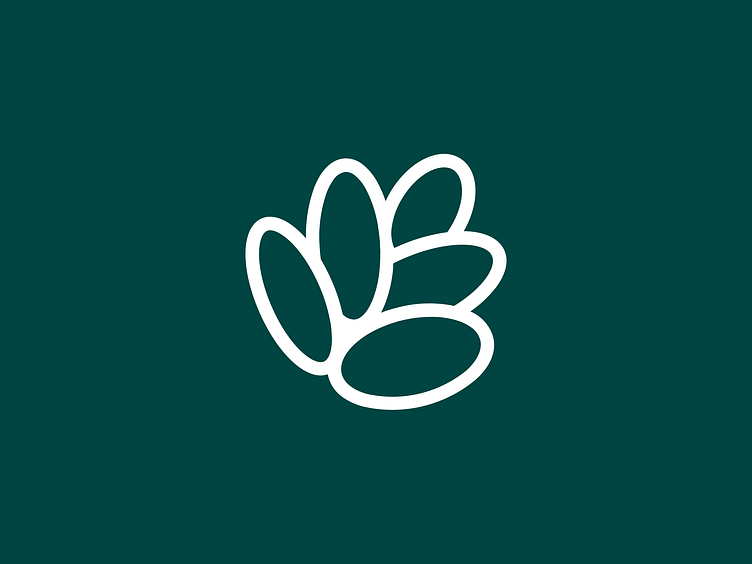
The Belle Provence boutique logo was inspired by the magnificent lavender fields characteristic of the South of France. Specializing in the sale of 100% natural handmade soaps with summery, floral scents, especially lavender, their boutique offers a unique sensory experience. The logo, symbolizing softness, summer and soothing, is designed with unique colors and shape, highlighting the beauty of this emblematic flower.
Combining two distinct fonts, the logo fuses the artisanal aspect with a touch of professionalism and seriousness. One handwritten font evokes authentic craftsmanship, while the other, with its serifs, reinforces the boutique's image as a serious, professional establishment.
This subtle graphic identity perfectly embodies craftsmanship while offering a soft, floral visual experience.
To see the complete project, please visit my website.
Interested in a collaboration? Get in touch!
Say hello to contact@camilledeoliveira.com!


