Elevating Dashboard Experience

Restructure invoice system
This dashboard is used for billing and factor management, as well as for creating and sending invoices to customers, as well as managing the entire billing process and coordination between employees.
Problem
Currently, the dashboard has a rough and unfinished design that complicates user navigation and finding what they need. The layout is cluttered or confusing, leading to suboptimal user perception. Additionally, responsiveness and mobile access issues arise, limiting the number of users who can access the monitoring panel from their preferred devices. Overall, these factors contribute to decreased engagement and utilization of the dashboard.
Goal
The primary objective is to enhance the design and user-friendliness of the dashboard, aiming to improve the overall user experience and increase engagement with the platform.
Research and Analysis
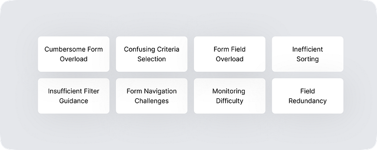
To initiate the redesign process, I conducted a series of interviews with my friends who actively use the current invoicing system. From these discussions, I identified several key pain points:
Filter Issues: Many users encountered difficulties using filters for invoices based on various criteria, leading to confusion and inefficiency in the process.
Cumbersome Form: The existing invoicing system featured a bulky form with an excessive number of fields, proving to be too burdensome for users.
Lack of Clarity: Users also expressed dissatisfaction with the lack of clear visualization and control over invoicing tasks. The current system did not provide enough information to meet their needs and present a comprehensive view of the process.
Design and Development
Building upon extensive research and meticulous analysis, I crafted wireframes and prototypes to bring the redesigned invoicing system to life. The overarching design principles centered around simplicity, user-friendliness, and customizable functionalities. The ensuing design seamlessly integrates the following key features, aiming to elevate user experience and streamline invoicing processes:
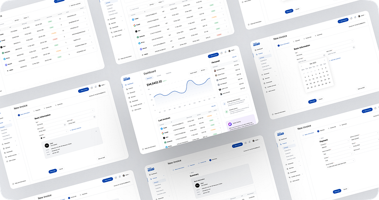
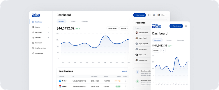
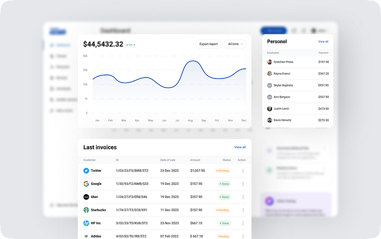
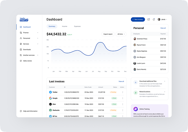
1. Dashboard
A dasbopard has been added that did not exist. The dashboard provides users with full visibility and control over their billing tasks. This panel displays important billing-related information, which improves user control over their billing responsibilities.New Dashboard Features Include:
Interactive Chart: The addition of an interactive graph offers users a holistic view of overall statistics. Users can seamlessly toggle between income and expenses, with the flexibility to switch between different time periods.
Recent Invoices Section: In this dedicated section, users can conveniently access and review the latest invoices issued, along with essential details, ensuring they stay informed about recent invoicing activities.
Employee Insights: For user convenience, a dedicated 'Employees' section has been introduced. This feature allows users to effortlessly track and review the latest transactions, providing a quick overview of recent employee activities.
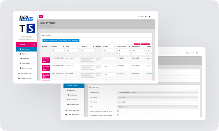
2. Filter System
Redesigned Filter System: The objective was to significantly enhance user experience by simplifying the process of filtering invoices based on a wide range of criteria. This improvement aims to eliminate confusion and enhance the overall effectiveness of the invoicing process.

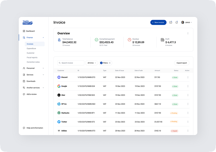
3. Invoicing
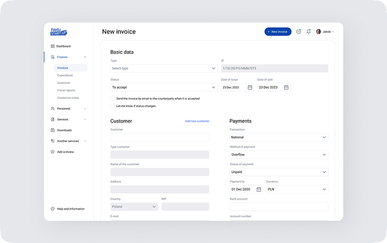
During the first stage of dashboard restructuring, changes were implemented in the 'Create a New Invoice' section, consolidating the entire invoice creation process onto a single page with corresponding forms. Additionally, a 'Clients' section was developed, presenting client data in the form of cards.However, following testing by my friends, it became evident that this dashboard variant is inconvenient to use and lacks sufficient readability. They identified specific issues such as navigation complexity, information structure ambiguity, and unsatisfactory organization of sections.
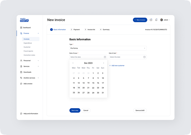
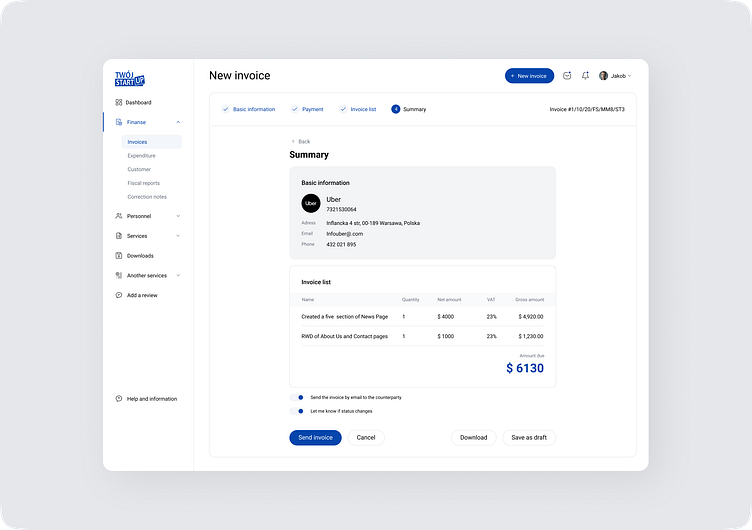
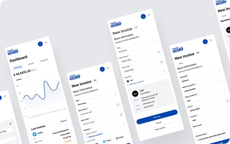
Therefore, the Create New Invoice section has been updated and presented in a step-by-step format. This revised structure breaks down the invoicing process into smaller and clearer steps, making it more user-friendly.
Four steps were created in total, each providing a user-friendly interface:
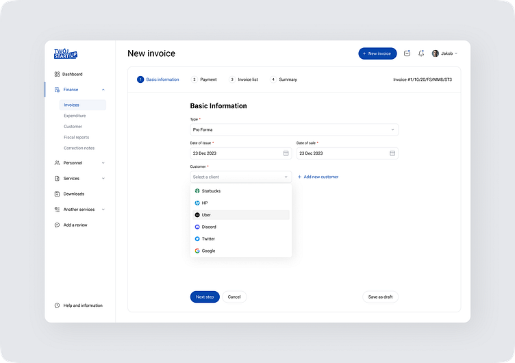
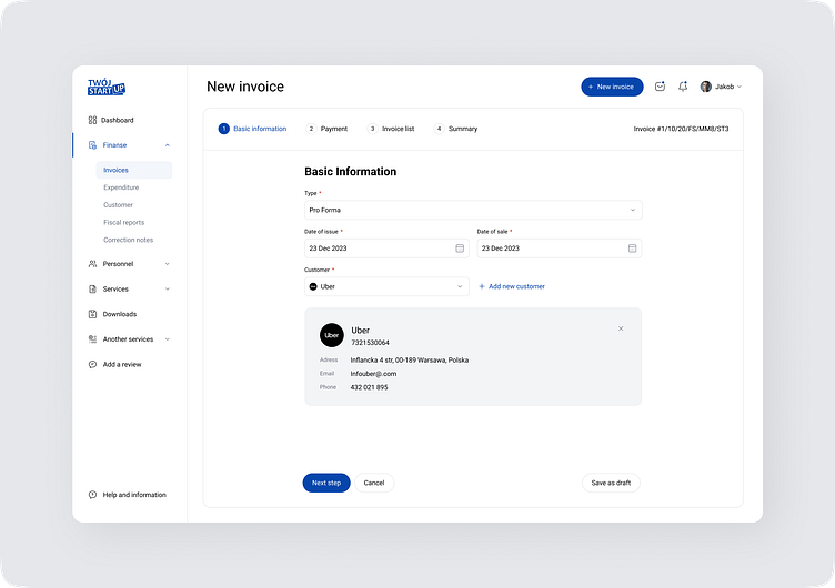
First Step - General Information
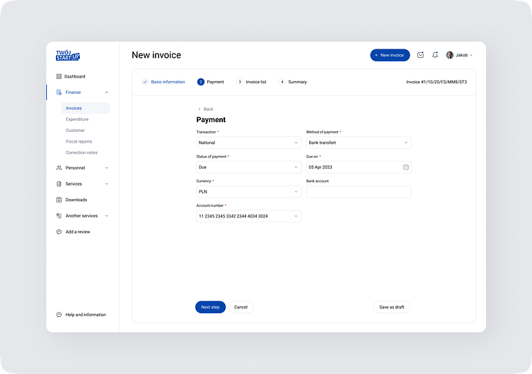
Second Step - Payment Method
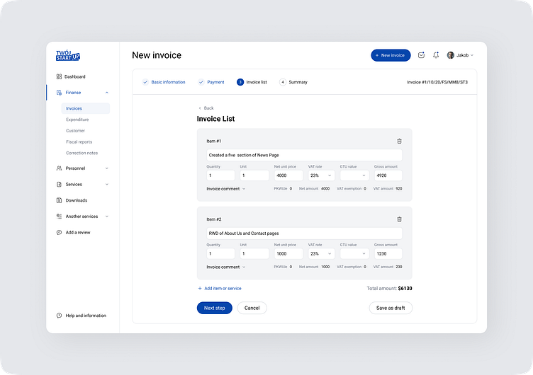
Third Step - List of Services
Fourth Step - Summary Information
Users can now easily follow these steps, rendering the entire invoicing process more structured and understandable.
4. Mobile Compatibility
The redesigned invoicing system was made mobile-compatible, making it easier for users to create and manage invoices on the go.
Results
The revamped invoicing system yielded a multitude of advantages for my friends, including:
Boosted Efficiency: The system not only saved time but also significantly enhanced efficiency, resulting in a 50% reduction in the time spent on creating and managing invoices.
Elevated User Experience: With a more intuitive and user-friendly design, the overhauled invoicing system minimized the likelihood of errors, contributing to an improved overall user experience.
Advanced Visibility and Control: The dashboard granted users heightened visibility and control over their invoicing responsibilities. This translated into more prompt payments and a notable enhancement in overall cash flow management.
Enhanced Mobile Accessibility: Thanks to the system's mobile compatibility, users could effortlessly access and manage invoices while on the move. This feature amplified flexibility and productivity for users managing their invoicing tasks remotely.
Conclusion
The redesign of the invoicing system enabled my friends to simplify the invoicing process, improve the user experience, and provide users with more visibility and control over their invoicing tasks. The redesign resulted in increased efficiency, improved user experience, and improved cash flow for the businesses. As a product designer, I was able to successfully meet the needs of my friends and create a successful product redesign that met their requirements and improved their business processes.


