Apex Arts 01

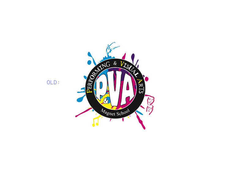
Here's a new logo, name, and tagline we developed as part of a massive rebrand for Apex Arts, formerly Anne Arundel County Public Schools Performing and Visual Arts Magnet Program — a performing and visual arts program for public school students in middle and high schools in Maryland, USA.
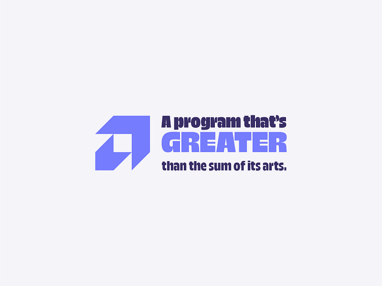
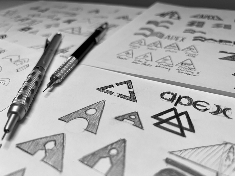
The concept for this rebrand was directionality as a visual metaphor for the arts as a "way up" for creative public school students.
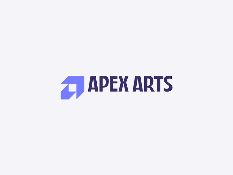
The geometric logomark represents an "A" as well as an upward-pointing arrow, but there are additional layers of meaning. It also appears as two opposing chevrons, and even as a dimensional optical illusion, with both a large box extruding down and to the left, with a smaller box inside, extruding up and to the right. This was all an intentional acknowledgment that there are many paths to a child's success, not all of which will be strictly linear.
The custom logotype, based loosely on Trois Mille, was intentionally designed with humanist eccentricities — as well as references Art Deco typography — as a nod to the fluidity of the creative process.
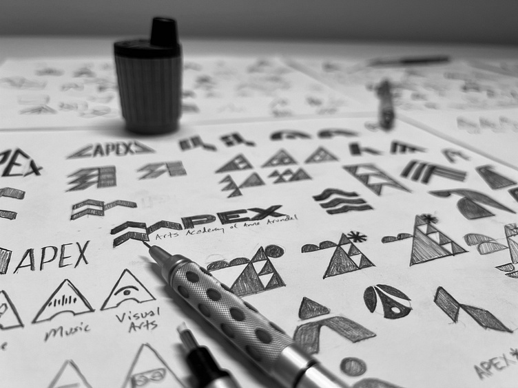
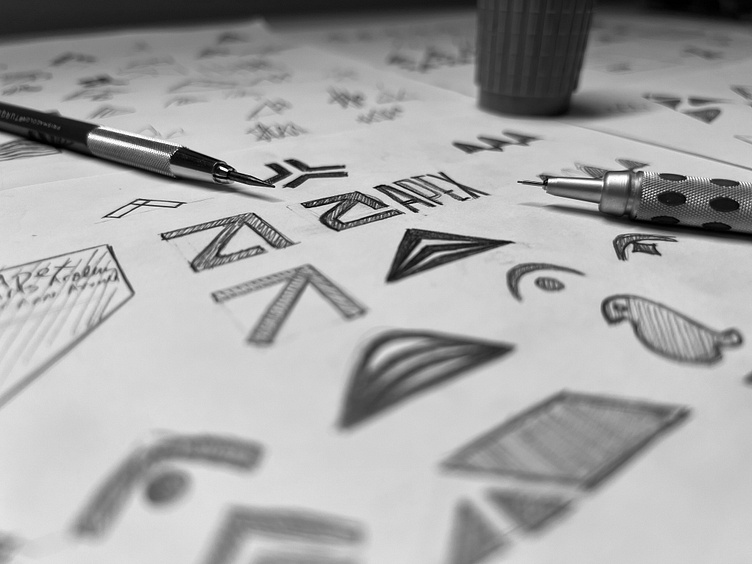
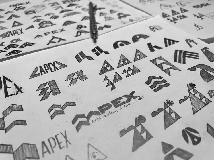
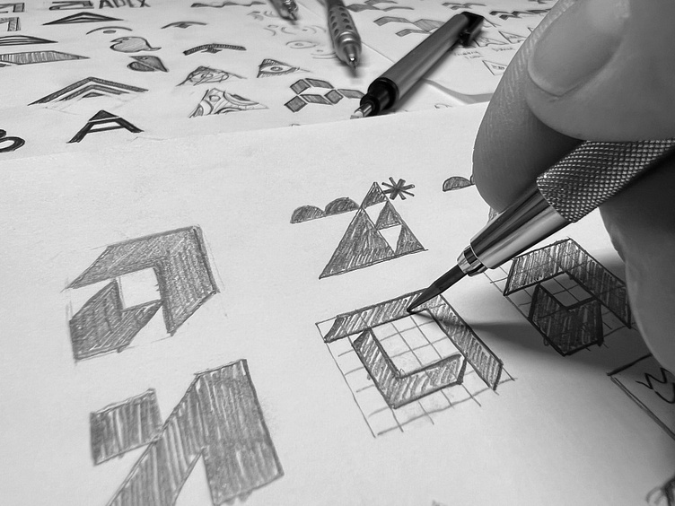
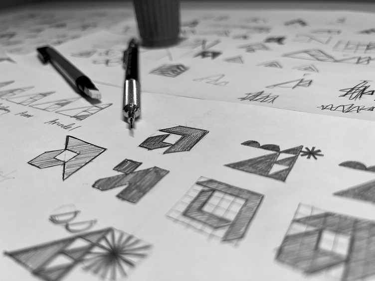
Sketches
Logo system
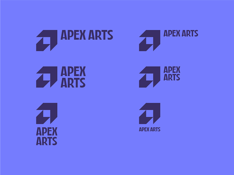
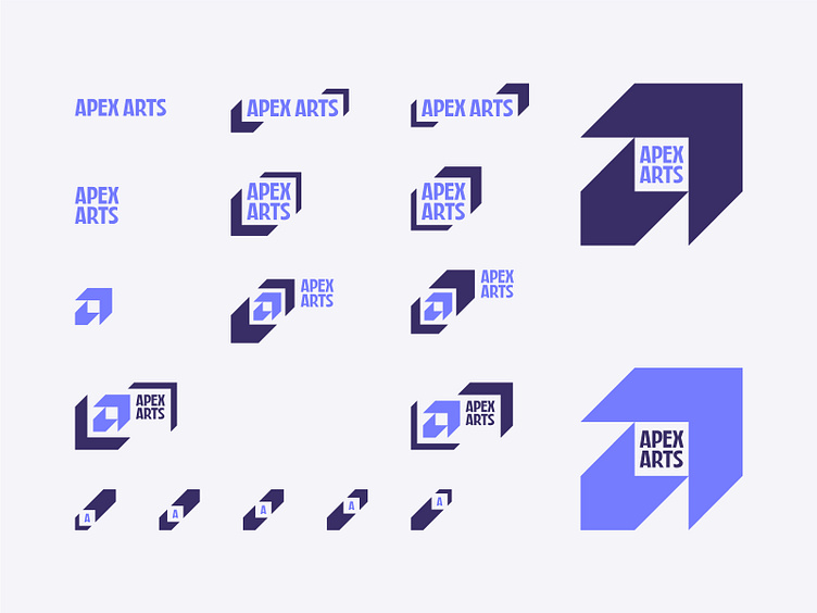
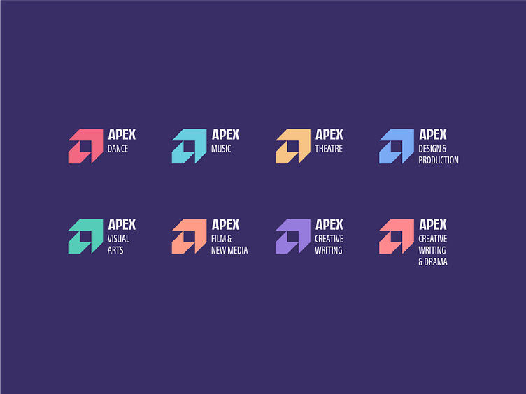
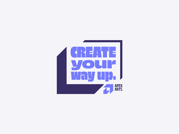
In addition to a Primary logo system of linear and stacked lockups, we also developed a Secondary logo system featuring a number of different lockups, some of which use the chevrons from the logomark as graphic elements.
We also needed this system to be flexible enough to incorporate a system of lockups for the 8 "Primes," or creative disciplines Apex Arts provides.
There's so much more of this rebrand coming soon…