Lakehawks Athletics | 01

Lake Sumter State College (LSSC) provides an athletic program for its students to compete in for 2 years before moving to a 4 year institution.
What started out as an inquiry to polish up the current athletic logos and to create apparel, turned into a full rebrand of the athletic identity. This came to fruition after assessing the current branding and understanding what the school wanted to achieve.
– Identified Problem
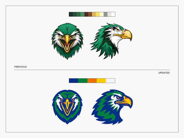
After a brand audit, we identified some problems that needed to be addressed that were holding the visual identity back: The current iteration of the two hawk logos had way too many colors (12 in all). Versatility and scaling to a smaller size would be virtually impossible in such cases as embroidery and screen printing. There is a lot of small detail which doubles down on the versatility and scaling issue while making these feel more like an illustration rather than a logo for a collegiate athletic program.
– Approved Solution
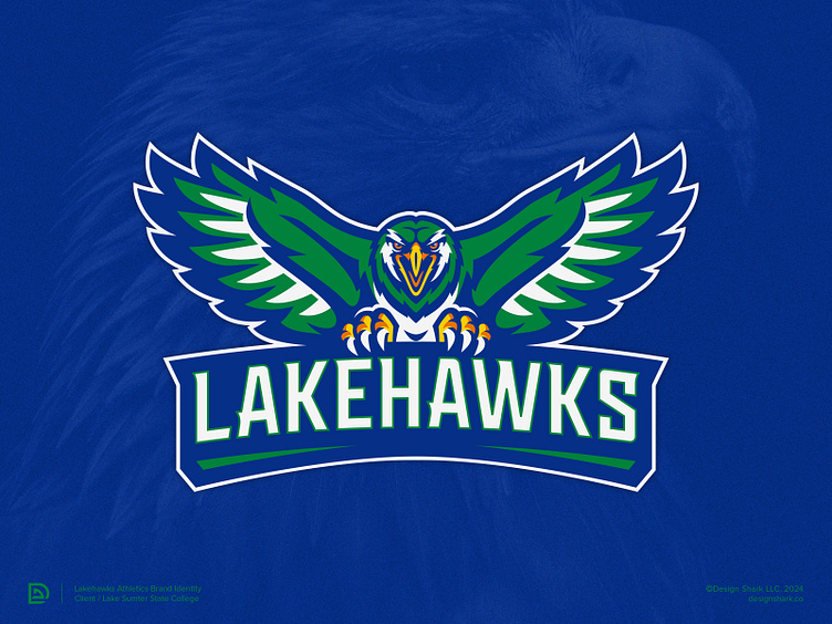
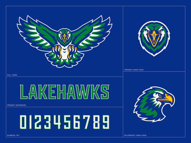
To combat the issues listed above, I proposed the following solution that was approved by the school: Refine Lakehawk heads (frontal & side view) by simplifying the detail to become more flexible for usage within a visual system. Reduce the brand palette to use 3-5 colors max. Refresh to resemble a more high-level and modern pro sports identity while retaining the fierce character. Expand the visual identity by creating a body for the frontal hawk head that matches the new simplified aesthetic of bold, modern and fierce. Update the “Lakehawks” wordmark to be more custom and match the new aesthetic of the visual system.
The results included a much stronger, flexible and cohesive visual identity that is more representative of not just LSSC but of a collegiate athletic program.

Ready to give your brand the look and feel of a big time sports organization?
Website | Instagram | Twitter(X) | LinkedIn


