Dink Pickleball

Designing a Playful Logo for Dink Pickleball
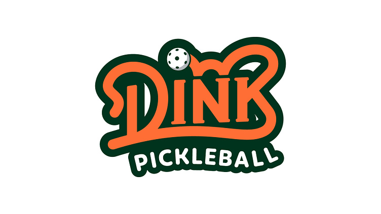
I was tasked with creating a fun, lively logo for Dink Pickleball, a new pickleball startup based in Cape Town.
Rather than taking a similar approach to my previous logo work for Atlantic Padel, which prominently featured a padel racquet, I wanted to go in a different direction for Dink. The goal was to design something more typographic and text-based, with a colorful, playful element added in.
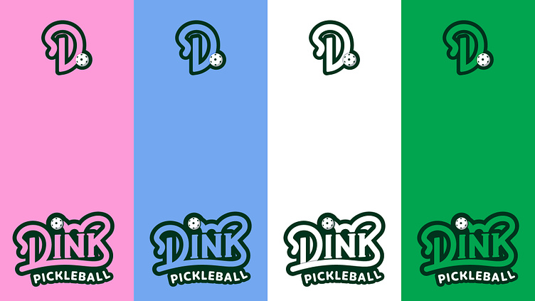
I played around with some bubbly, bouncing letterforms to reflect the energetic nature of pickleball. The final wordmark incorporates a customized, hand-drawn font with a friendly, approachable vibe. A vibrant gradient palette of greens, yellows and pinks injects a sense of liveliness and levity.
Overall, the Dink Pickleball logo aims to capture the sport's welcoming spirit and enthusiasm in a fresh, energetic logo design. Let me know what you think!
Interested in playing pickleball in Cape Town? Reach out to Dink Pickleball - https://www.instagram.com/dinkpickleballza/


