Atlantic Padel

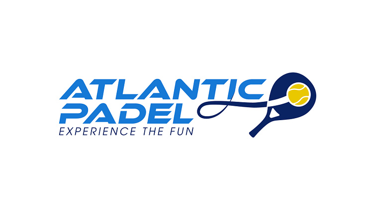
When tasked with creating a logo for Atlantic Padel, the client had a very clear vision - they wanted the logo to prominently feature a paddle racquet to represent the sport.
Knowing this key requirement upfront allowed me to focus my design efforts on stylizing the paddle imagery in a way that would capture the lively, sunny spirit of this Cape Town-based venue.
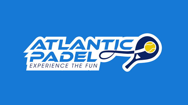
I opted for a color palette of vibrant yellows and blues, reflecting the bright Cape Town sunshine and coastal hues. The padel is boldly centered in the wordmark, with clean typography and ample negative space allowing it to take focus.
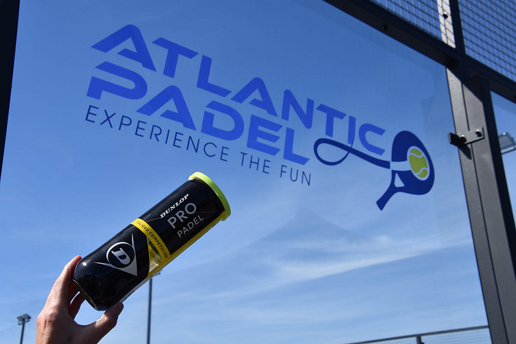
Since completing the project, I've loved seeing Atlantic Padel grow into a beloved local spot for padel, with world-class courts that attract players from around the globe. The logo encapsulates their passion for the sport - check out some pics from AtlanticPadel.co.za to see their amazing facilities in action!