Axe Software - Brand Guidelines.

Axe Software Brand Guidelines.
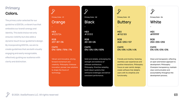
PrimaryColors.
The primary color selected for our guideline is Orange (#ED5724), a vibrant hue that embodies our brand's energy and identity. This bold choice not only ensures visibility but also adds a dynamic touch to our guideline's design. By incorporating ED5724, we aim to create guidelines that are both visually engaging and easily recognizable, effectively guiding our audience with clarity and distinction.
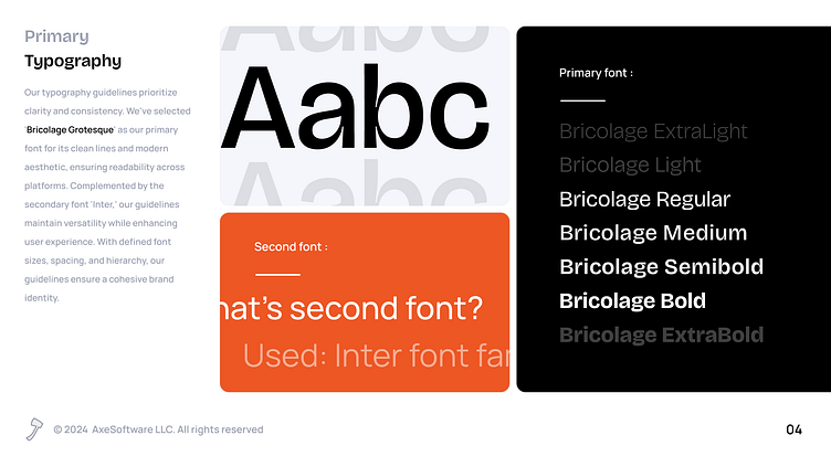
PrimaryTypography.
Our typography guidelines prioritize clarity and consistency. We've selected 'Bricolage Grotesque' as our primary font for its clean lines and modern aesthetic, ensuring readability across platforms. Complemented by the secondary font 'Inter,' our guidelines maintain versatility while enhancing user experience. With defined font sizes, spacing, and hierarchy, our guidelines ensure a cohesive brand identity.
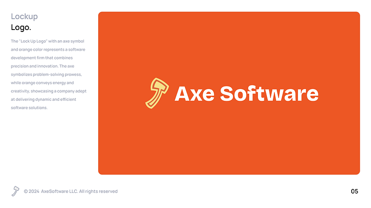
LockupLogo.
The "Lock Up Logo" with an axe symbol and orange color represents a software development firm that combines precision and innovation. The axe symbolizes problem-solving prowess, while orange conveys energy and creativity, showcasing a company adept at delivering dynamic and efficient software solutions.
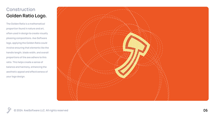
Construction Golden Ratio Logo.
The Golden Ratio is a mathematical proportion found in nature and art, often used in design to create visually pleasing compositions. Axe Software logo, applying the Golden Ratio could involve ensuring that elements like the handle length, blade width, and overall proportions of the axe adhere to this ratio. This helps create a sense of balance and harmony, enhancing the aesthetic appeal and effectiveness of your logo design.
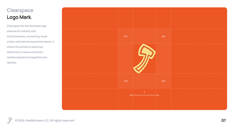
Clearspace Logo Mark.
Clearspace for Axe Software logo ensures its visibility and distinctiveness, preventing visual clutter and maintaining brand impact. It allows the symbol to stand out effectively in various contexts, reinforcing brand recognition and identity.
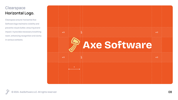
HeadiClearspaceHorizontal Logo.g
Clearspace around horizontal Axe Software logo maintains visibility and prevents visual clutter, ensuring brand impact. It provides necessary breathing room, enhancing recognition and clarity in various contexts.
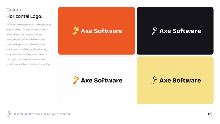
ColorsHorizontal Logo.
Different color options in the horizontal logo with the "Axe Software" accent allow adaptation across various backgrounds. It's crucial to choose contrasting color combinations for clarity and consistency. Considering brightness and background nuances, the right color selection enhances visibility and attractiveness of your logo.
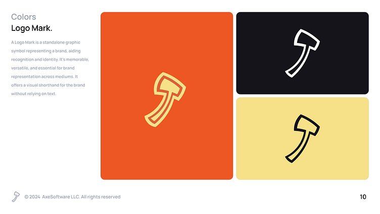
ColorsLogo Mark.
A Logo Mark is a standalone graphic symbol representing a brand, aiding recognition and identity. It's memorable, versatile, and essential for brand representation across mediums. It offers a visual shorthand for the brand without relying on text.
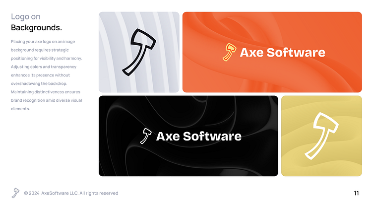
Logo onBackgrounds.
Placing your axe logo on an image background requires strategic positioning for visibility and harmony. Adjusting colors and transparency enhances its presence without overshadowing the backdrop. Maintaining distinctiveness ensures brand recognition amid diverse visual elements.
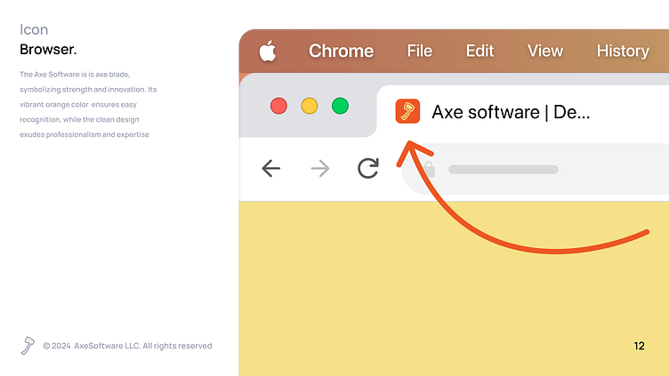
IconBrowser.
The Axe Software is is axe blade, symbolizing strength and innovation. Its vibrant orange color ensures easy recognition, while the clean design exudes professionalism and expertise
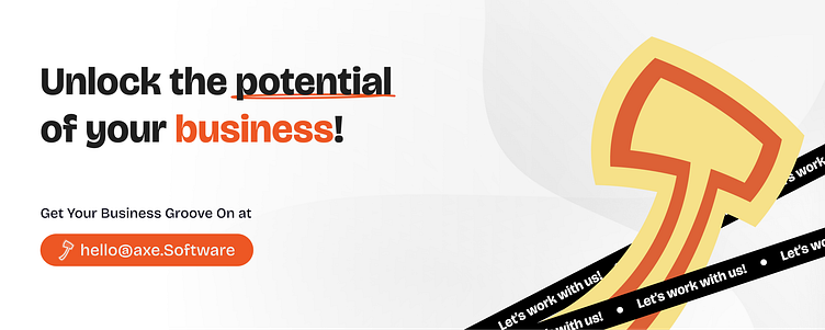
Contact Us
Ready to solve your business challenges together? Reach out to us now and let's make magic happen!