ZeldaGuide

30 day logo challenge — Day 2!
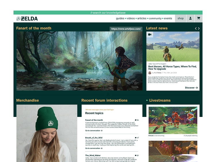
Creative briefing: We need a new visual identity for a small publisher called ZeldaGuide. They create and curate content ranging from guides, tutorials, videos, articles, and community events around Legend of Zelda games. They're mostly struggling with finding a visual identity for their website visitors and blogportals. For obvious reasons we should set up a unique identity, stepping away from potential copyright issues with Nintendo; so not using the typical typefaces. However, we would appreciate creating a symbol for the primary logo design, using similar color pallettes, stylistic references and visual language from the Zelda franchise. The logo will also be used for some merchandising, so it can be maximum 3 colours (silkscreen printing process).

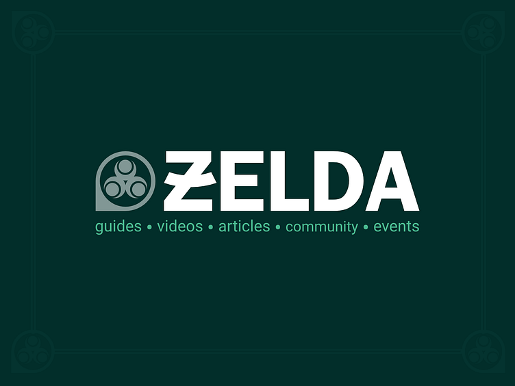
Reflecting on the creative brief, ZeldaGuides aims to be the ultimate online knowledgebase and community, specializing in videos, articles, and community events around Legend of Zelda games. In our logo's icon, we've seamlessly blended four key elements. First up, the looking-glass, a nod to the digital knowledge base loaded with tutorials to level up your game. Next, the location marker—declaring ZeldaGuides as not just "thé place to be" online but also pinpointing their real-world community events. Third in line is the iconic Triforce, a stack of triangles symbolizing wisdom, courage, and strength. Our icon-pointer subtly directs towards the Triforce of Wisdom, the bottom left triangle. Lastly, the Triforce of Wisdom icon itself embodies the essence of Nayru, the Goddess of Wisdom, bringing divine wisdom and mystical abilities to its holder. It's not just a franchise nod; it doubles as a community icon—picture three gamers standing back to back, conquering their favorite games together.
For the typography we choose ITC Franklin Gothic STD 'demi', a font designed by Morris fuller Benton & Victor Caruso. This bold sans-serif was originally released in 1905 by American Type Founders and has a classic “newspaper” feel to it, which makes it a great font for editorial usage on the web. Just like the Triforce icon from the Zelda franchise, it's balanced and geometric. This fits the client briefing, to make a strong distinction from the original franchise' visual identity which features a bold serif fond with a lot of ornamental decorations. To still reference to those little details, we added a smile into the Z. A wink to the enthousiasm of the community. For the baseline, we choose to combine Franklink Gothic with Roboto for it's versatility in weights and ease of use (google font). Instead of using comma's, or bulletpoints between the topic-pillars we choose to reference to the hearts used as the in-game health indicator.


