Decoding UI Design: Affordances, Signifiers, & Spacing.

Dive into the anatomy of seamless app design with our latest UI breakdown! Swipe through to uncover the roles of affordances, signifiers, and feedback in creating an intuitive user experience. 👆📲
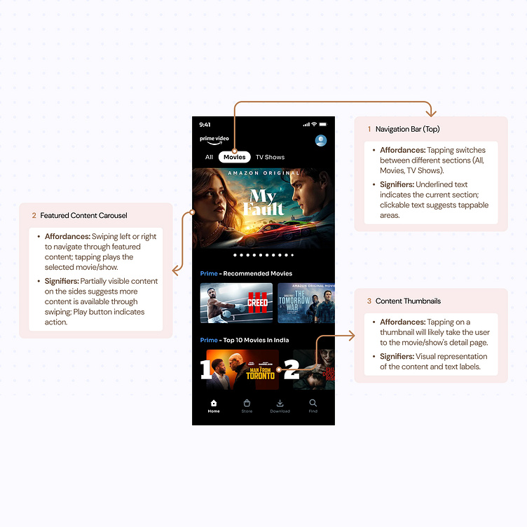
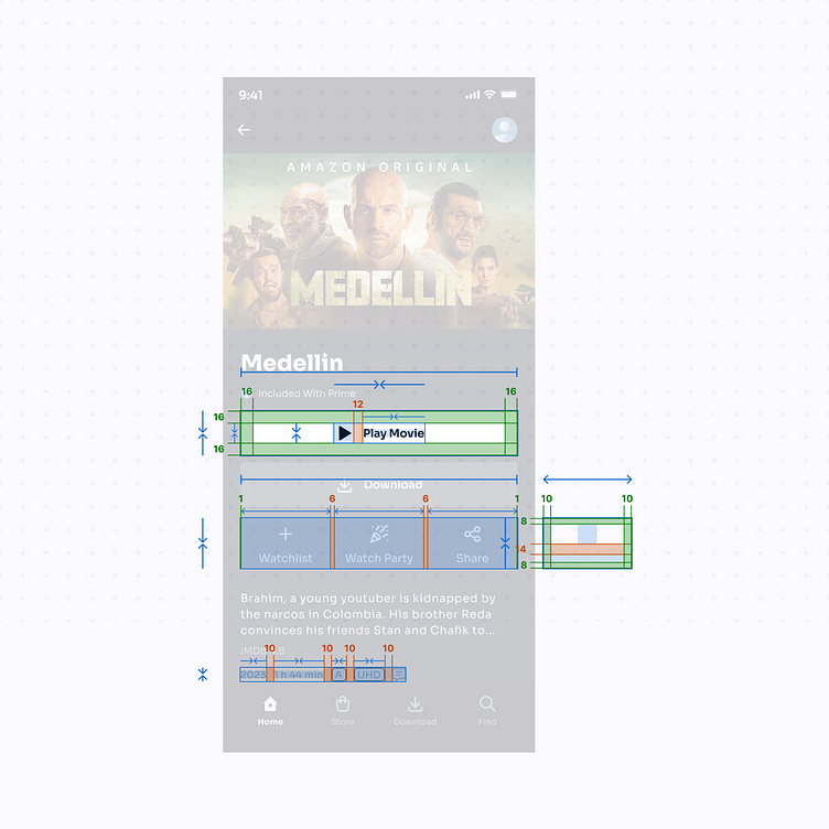
1️⃣ Navigation Bar: Where a tap changes your view. Notice the underlined text? That's a signifier guiding you on where to press.
2️⃣ Content Carousel: Swipe left or right to explore. The side previews are subtle nudges about more content to discover.
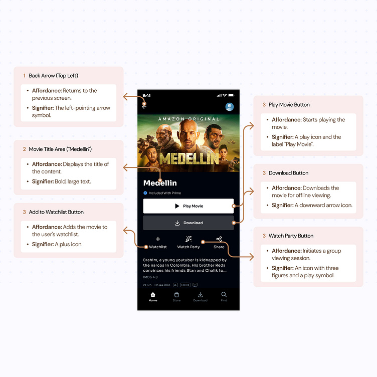
3️⃣ Action Buttons: Each with its purpose - playing media, downloading, or sharing content, their icons are universal languages speaking directly to your fingers.
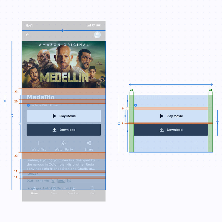
🔍 Plus, notice the precision in spacing? That's the 8/4 point grid system at work, the backbone of a design that's easy on the eyes and makes every tap a delight.
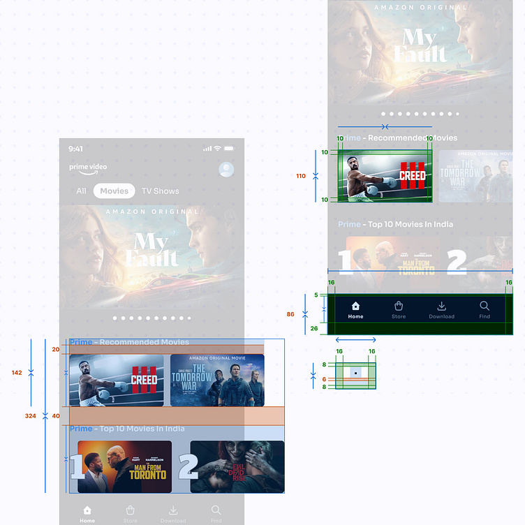
UI measurements to guide developers and designers in implementing a consistent and harmonious design that adheres to established UI principles, creating an intuitive and user-friendly experience.
See how each element of the design invites interaction and responds to your touch, while perfect spacing ensures clarity and harmony.


