TripleWP

30 day logo challenge — Day 3!
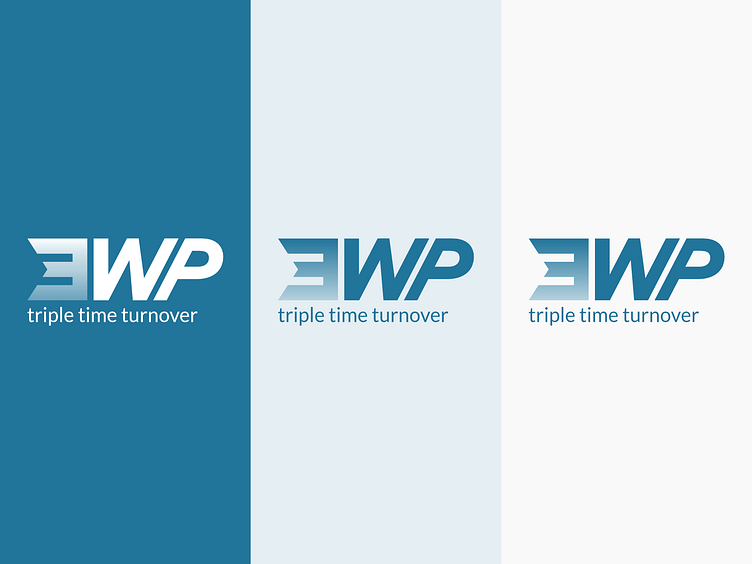
Creative briefing: We need a new visual identity for TripleWP, a new application that simplifies the user experience of developing a website within Wordpress. The name TripleWP goes back since our first beta users were able to design and update their websites around three times faster than the traditional method of writing code. The WP part of the company name is a standard abbreviation of Wordpress and is an indicator to our audience of where the software can be installed. We really want to get a visual identity that is friendly, not intimidating and incorporates a typeface that reflects our cutting-edge tech. The Cloudflare logo is a great example of these ideals. In addition, a majority of the application has already been designed around a blue, white, and black color scheme that the logo should also use. We're not against having the design be abstract; I know it’s impossible to convey all of the software’s features in a single symbol.
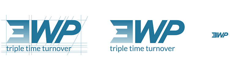
Psychology-marketing studies show that numbers are memorized easier by people, while also making a statement against more conservative competitors. In our logomark, the 3 stands as a solid promise. Built up from a strong geometric square, it shows off the robustness of the software tool—while the arrow indent already suggests moving forward in time. As of the W we've chosen for a slanted representation of typography, which only increases in the P. The gradient brings a softness to the logo—with the blue color being an exact copy of the Wordpress platform. The visual identity is completed by adding a secondary blue tone, and an off-white color scheme. To strengthen the wordmark for TripleWP, I've added a strong statement baseline: "Triple Time Turnover" (not coincidentally 3 t's), supporting the brand mission and promise.