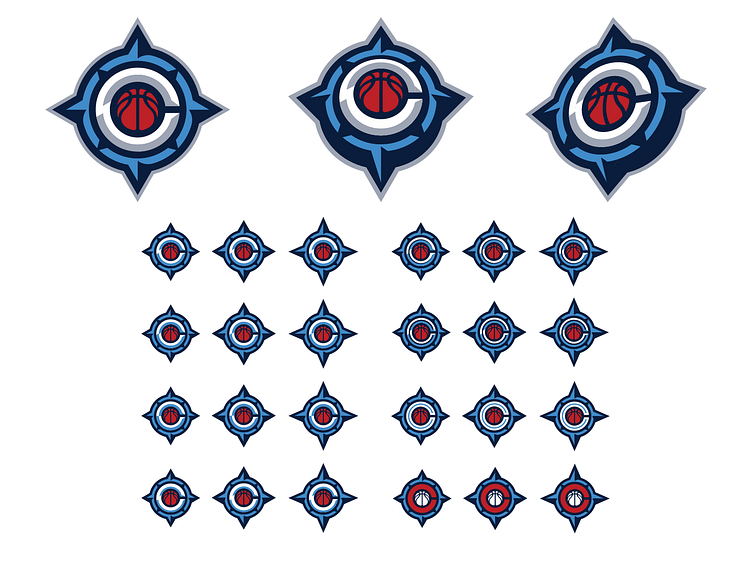
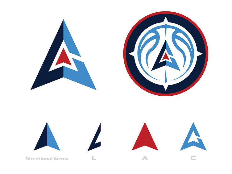
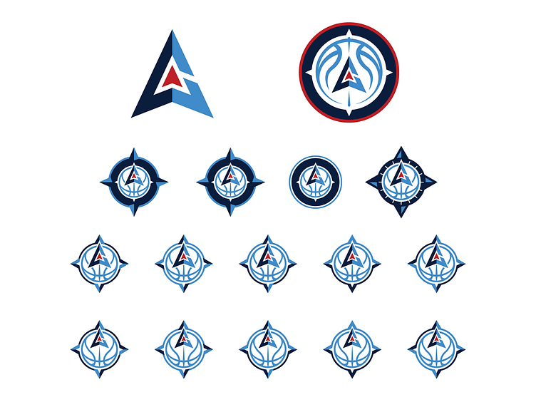
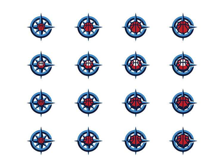
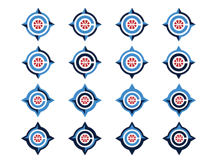
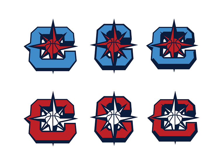
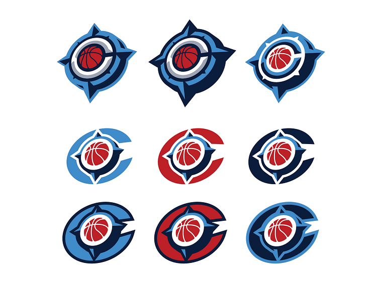
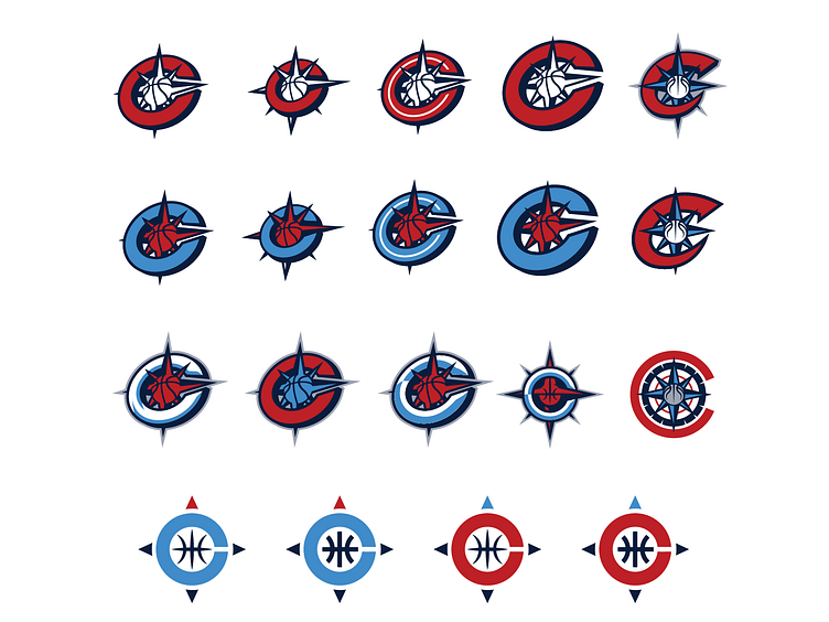
LA Clippers Unused Logos

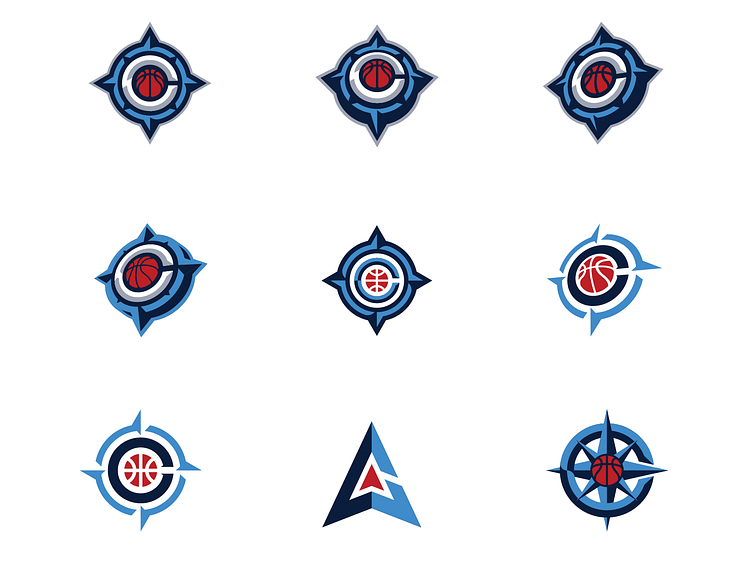
A couple years ago I was contracted with Doubleday & Cartwright in the early stages of the LA Clippers rebrand project. I was brought in to do punch-up and pitch some of my own ideas for concepts that they hadn't explored and these are a few of the dozens of options I created during that "sprint". At the time the creative brief required a compass, a basketball, a C, and the colors you see here. The one big difference between this and the final product - I was told not to explore any options involving a boat or ship.
Keep in mind these are only early drafts created in the very early stages of the rebrand process, these are just a small fraction of what was explored, and we were trying to test the boundaries of a specific set of parameters. Biggest challenge was avoiding looking like the Seattle Mariners and repeating concepts already explored by the other art directors. Ultimately the team went in another direction, but landed on what is, in my opinion, a successful rebrand and a lot of the DNA from what we created shines through in the final product. Just wish I would've been allowed to mess around with some boats!