Zone Marine - Mobile Design

Welcome to Part 4, the Zone Marine mobile series! 📱
I'll share a few shots of the mobile-responsive design I've done for Zone Marine, the last few projects are showcasing some of the desktop designs.
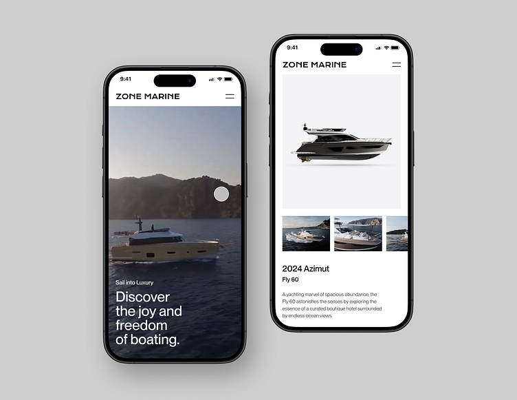
First up, check out the left screen.
That's where the magic of our mobile menu comes to life. With just a tap, you can move around the nav like a pro, whether you're browsing boat models or other pages.
Now, shift your attention to the right screen.
Here, you'll find yourself on a scroll through the in-stock "boat page."
And let's talk about those animations!
Everything is done by me in Figma Prototype, which is so cool, as it saves me a ton of time so I can post more often. I even cropped the mockups str8 from Figma proto. 😅 Impressive job Figma! ❤️🔥
Sound on 🔊🔊🔊
⏤⏤⏤⏤⏤⏤⏤⏤⏤⏤⏤⏤⏤⏤⏤⏤⏤⏤⏤⏤⏤⏤⏤⏤⏤⏤⏤⏤⏤⏤⏤⏤
☞ Want to sail away like they did? Drop a line at viktorgajlovic97@gmail.com 👋
⏤⏤⏤⏤⏤⏤⏤⏤⏤⏤⏤⏤⏤⏤⏤⏤⏤⏤⏤⏤⏤⏤⏤⏤⏤⏤⏤⏤⏤⏤⏤⏤
Stay tuned for more Zone Marine mobile design shots. 🚤