Redesigning a Reports tab for better work

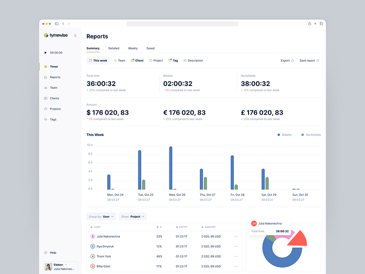
On the Reports tab, we found it useful to demonstrate a summary with a more detailed breakdown of time worked and the amount earned. The daily summary we visualized with bar charts and per-user (project, client, group, user, or tag) data is shown in the table or on a pie chart.
Get in touch to hire Eleken SaaS designers
Let us help you design, fix or scale your SaaS product!


