Shot 058 - Daily Traffic

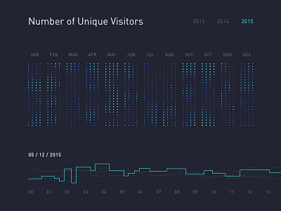
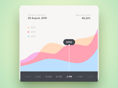
Today's upload is a visualisation of user traffic in a website over time, allowing you to see a complete heat map over the course of a year. You can switch between different years, with the lighter dots being more active than the darker once. You can also isolate individual days and see their hourly roadmaps against previous years for more granular comparison.
Really enjoyed this, and actually the approach was inspired by Nicholas Felton and his annual reports. Would love to try my hand at pushing my data visualisation skills further... maybe I need to learn to code next eh?
@2x. Thoughts welcome.