Dark Login \ Sign in Page UI UX Design + States

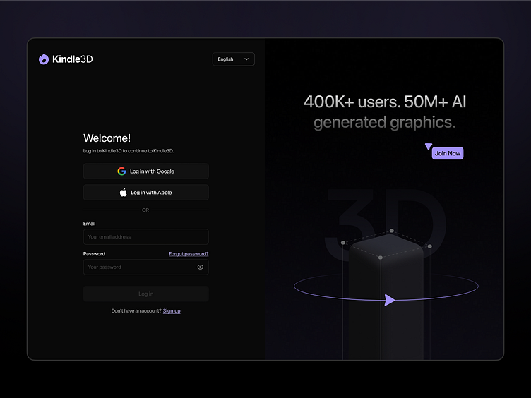
Today, let's look at the minimal & simplest UI design for the login page. I researched lots of login pages. The main problem I've seen is the visibility, copy and accessibility issues in dark mode design. So I tried my best to overcome that obstacle for you guys :)
Here are all the other states for the login page which you rarely get to see on Dribbble:
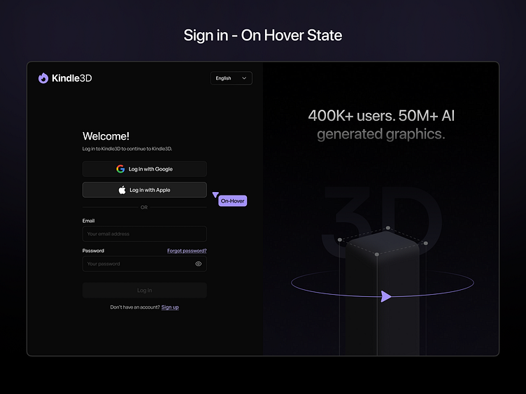
Hover State
The hover state is visible by making use of lighter grey and a more prominent stroke colour for better elevation.
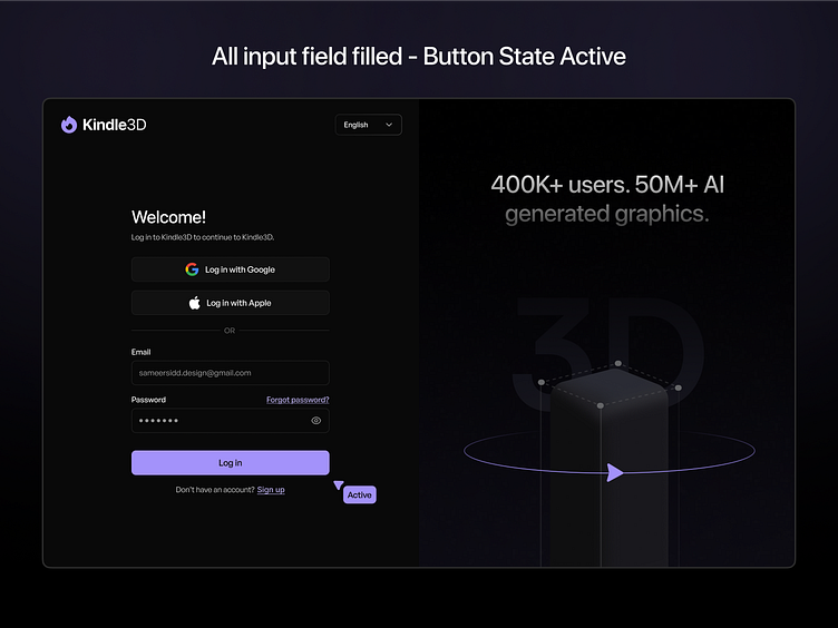
Filled input field + Active State
Only enabling the "Login Button" when the user fills all the input fields is one of the basic UX approaches but designers tend to forget it.
Another one is to make sure you don't confuse the end user by using Sign in and Sign up. Although it works, it's better to have "Login" & "Sign up" or vice-versa it separates both options.
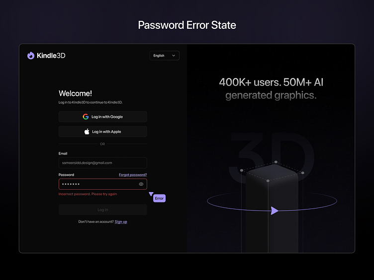
Password Error States
Last but not least take care of all the error states especially the incorrect password and wrong email format usually we can have a single error message "Email or Password is incorrect" but i like to separate it.
Moreover, there are more validation checks as well.
I hope you guys like it ❤
Follow me for real daily app and web design inspiration ✨
Have a project?
Email me at: sameersidd.design@gmail.com or message me on Dribbble!
That's All Folks!
Become a part of my community to learn more about UI UX.


