Axure responsive Ecommerce template3

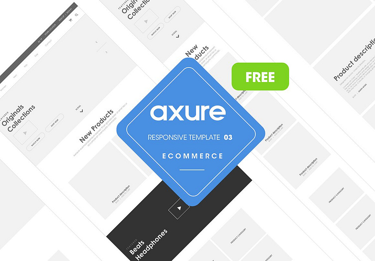
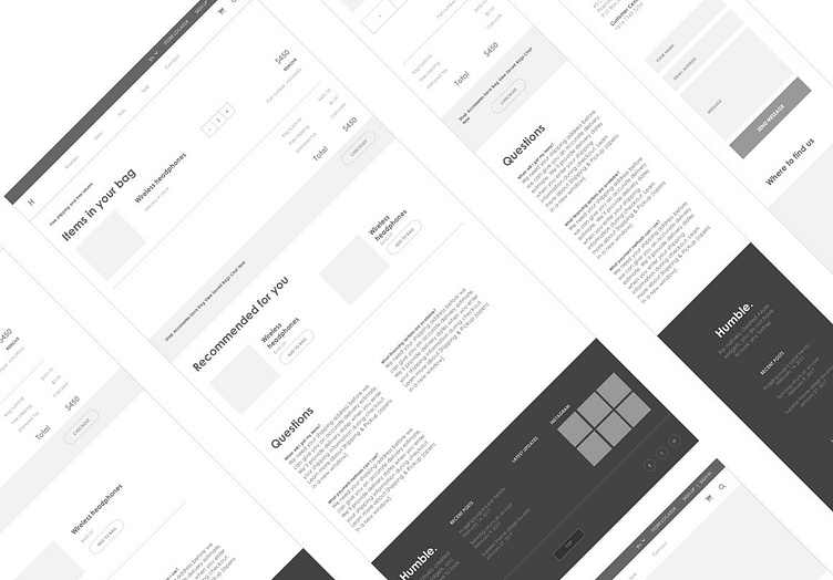
This product is a responsive web Axure RP template for an Ecommerce website volume 3 that has three views:
Desktop view designed to width 1200px
Mobile screen is designed to width 320px
Tablet portrait view of width 768px
This kit is created for designers who are wireframing and prototyping ecommerce/store project content for desktop, tablet and mobile views specifically.
To view the different screens one can preview the Axure file then resize the browser window to preferred dimensions or view on a mobile phone and tablet.
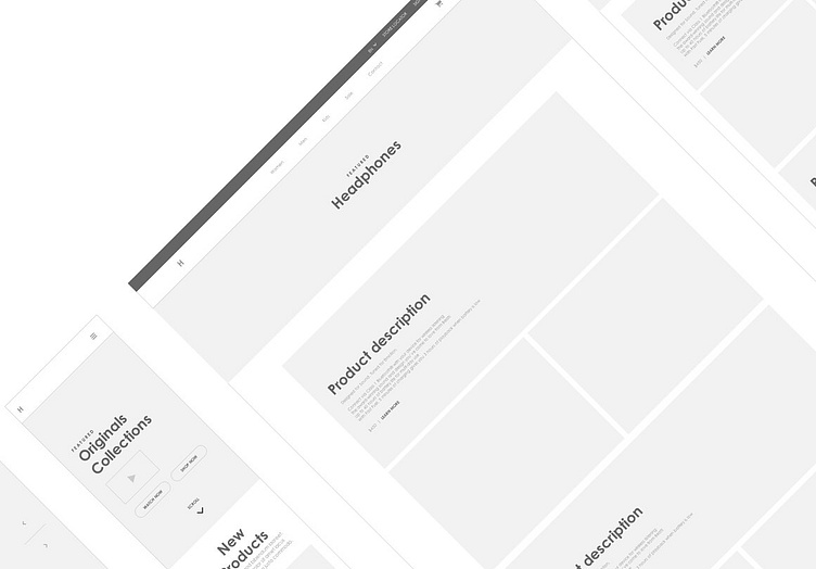
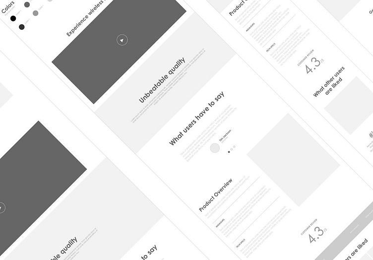
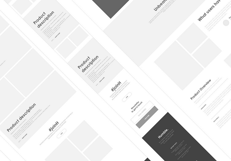
The file contains
Home page
Category
Product detail page
Cart page


