Moindy Logo & Branding

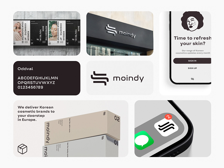
Moindy | Project description
The logo for Moindy, designed with the sleekness and precision that echoes the brand's ethos, embodies simplicity and modernity. Set against a dark background, the white, stylized typography suggests accessibility and clarity. The emblem, reminiscent of both Eastern calligraphy and contemporary Western design, suggests a bridge between cultures, fitting for a company that aims to bring Korean beauty products to European shores. Moindy's identity is thus represented as both a gateway and a curator of beauty, delivering authenticity and choice to the discerning consumer.
Interested in collaborating with Waywest?
Please feel free to reach out:
Our website
Drop us a mail - waywest.io@proton.me
Check our Instagram
Follow us on X
We're not so serious, by the way, so no need for LinkedIn language 🤪


