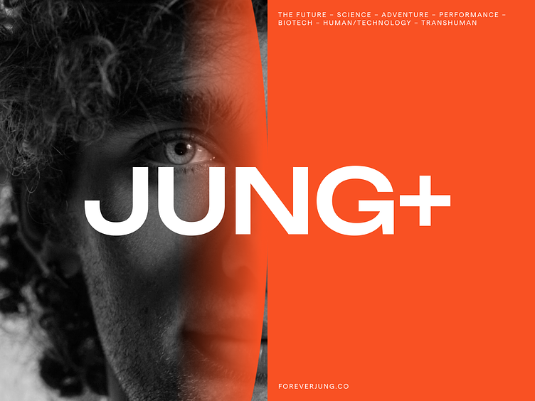
JUNG+ brand - Logo
Hey everyone! 🌟 Exciting news about our new project - Jung+
Let's start with a logo design! And it is more than just letters; it's a symbol of the human lifestyle and longevity. If you take a closer look, you'll notice a hidden gem: the letter 'G' subtly transforms into a circular arrow, representing the endless cycle of life. Paired with the plus sign (+), it signifies our commitment to longevity.
Gradients symbolize this transition from science to lifestyle, serving as an entrance from the scientific realm into daily life 🌝
So welcome to our creative journey, featuring fresh marketing materials 🤝
Share a comment or …
✉️ Drop us a few lines at hello@hbtat.agency
Learn more about our processes and capabilities at habitat.cc
View all tags
Posted on
Apr 23, 2024
More by habitat View profile
Like


