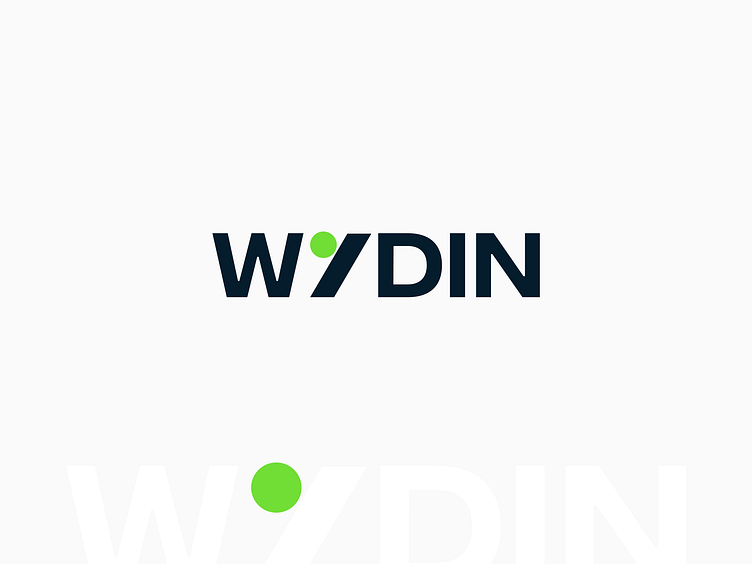
B2B Platform Logo Design

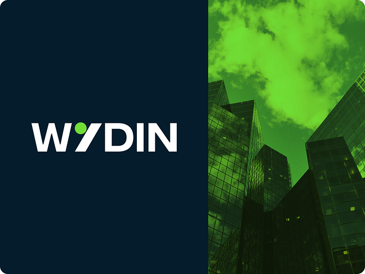
Logo for B2B service. Wydin means expand. The idea is that different businesses can connect on the platform. This is reflected in the letter Y. Geometric figures show the difference of firms, and close distance - their connection. They form the letter Y. A "wide" font is used for the logo.
Many ideas were created with the letters W and I, but the final wish of the client was to use the Y.