Appointment card redesign for MyConstructor

Issues
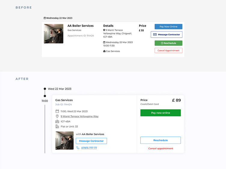
The appointment card had been updated many times without following any design guidelines. The result is crowded, confusing and with no clear button hierarchy.
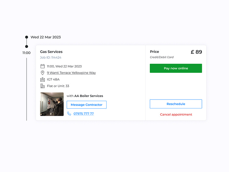
The new design organises the information in distinct groups and accentuates the main call-to-actions, all while keeping the same information if not more.
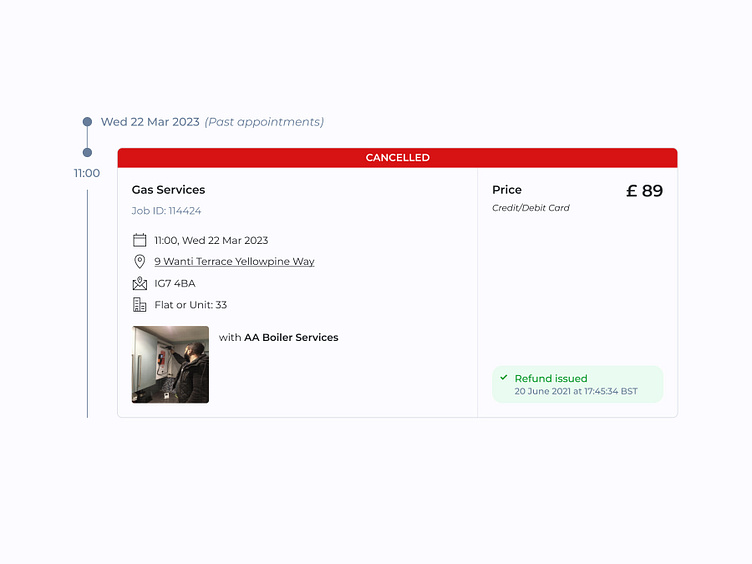
Cancelled appointment with informative refund status
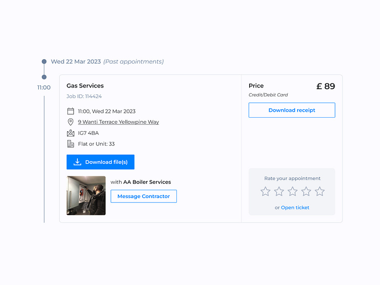
Past appointment
The client may download content such as certificates and receipts, rate their appointment with the contractor or open a ticket to solve possible issues.