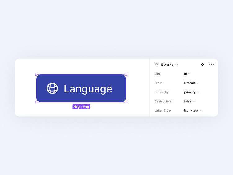
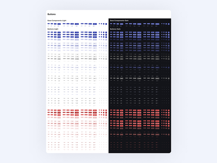
Button Components for UI Design System

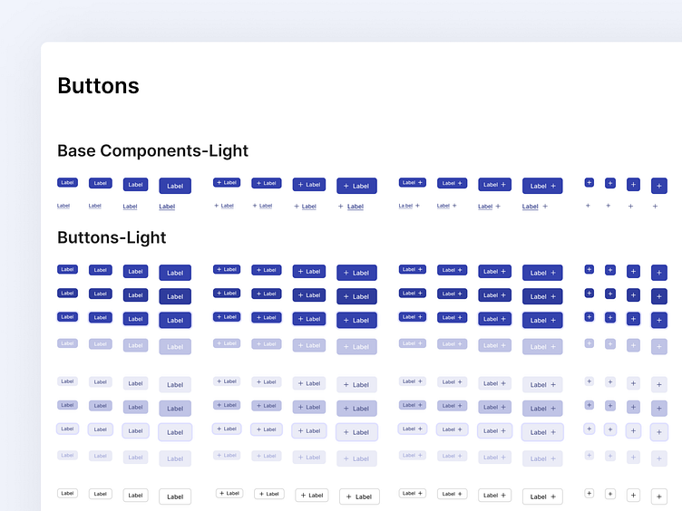
Properties;
Size=sm, md, lg, xl
Label Style=text, icon+text, text+icon, icon
State=default, hover, focused, disabled
Hierarchy=primary, secondary, secondary-gray, tertiary, tertiary-gray, link-primary, link-gray
Destructive=true, false