Flinto

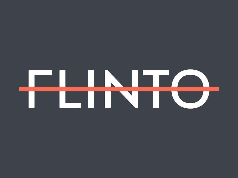


Earlier this month, Flinto tasked us with refreshing their wordmark and sub-brands. The original logo was set in Brandon Grotesque, which we used as a base. We created custom type for the new Flinto logo and the sub-brands, though the lowercase letters have much less in common with Brandon Grotesque.
As with most of our type projects, @Alexa Grafera sketched the letterforms and @Louie Mantia traced them.
We created two weights for "FLINTO". A thinner weight with a strikethrough as the company logo, and a slightly bolder version to accompany lighter text for the sub-brands.
Making custom type is difficult, but somehow familiar as we often draw symbols and other kinds of shapes. Type almost seems less forgiving than iconography. I'm excited whenever we're able to create custom type for our clients, and hope to show you other projects we've worked on soon!
Hire Parakeet for your project!


