VLC Redesigned UI #01

VLC media player is a popular free and open source multimedia player available for many operating systems and plays almost everything out there.
VLC also has support for themes that can alter the appearance of the player. But themes or "skins" have problems of their own and are limited to what they can actually change. While a skin would make VLC look almost like this I consider there are areas that need changes to make VLC more appealing.
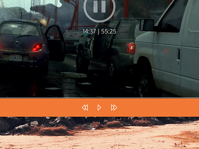
On this image I reorganized the cluttered player control area. By default it shouldn't have that many modules on. If the user then needs to have the extra modules these can be added then. It's also orange to drift away from the default gray and have a uniform look on the platforms it supports.
I also removed the menubar (Media, Play, Audio, etc.) from the window and instead added a button that would open a settings window (top right, 2nd button).
I added a full-screen button too. One could say that it's obvious to a user that double clicking the video area does that, but for the sake of discoverability it's there (top right, 1st button).
I also moved the time module (displays the file length and current playing time) to the center and above that an image showing whether the player is paused or playing.
The two buttons and the time module are all in an overlay that appears only on hover.
I changed the media seeker to resemble that of the current YouTube web player in its behavior. The media seeker slider is also not inside of player control area but outside, unlike VLC currently does.
Finally a much simpler and conventional volume slider.
I also changed the icon. I'm not a fan of the original but I kept the traffic cone thing going on.
The window decoration is part of the Breeze style used in Plasma 5.
I originally made this last year but never uploaded it.
Full-size image: https://ndisk.io//s.php?f=uriherrera0ODut4lN7R


