Pennsylvania Ballet Data Viz

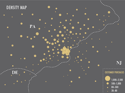
This is one of the data visualizations that I use within my Pennsylvania Ballet Infographic. I used Tableau to organize and set the data, and then I took screenshots of that graph into illustrator and copied the chart to make it more visually pleasing.
See the rest of this project at: www.behance.net/gallery/31320471/Pennsylvania-Ballet-Infographic


