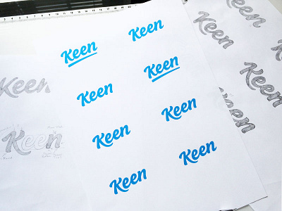
Keen Logotype Variations Shot


My client has asked for your guys help so please share you opinions in the comment.
We need to consider does it reflect the brand values? Can the K work alone as a stand alone icon for favicons etc? Which one balances a fun and corporate feel the best?
Background Info
Keen is officially an onboarding and success tool and they specialise in onboarding the customers/users of software as a service.
They'd like the branding to be:
- Friendly with a little bit of personality
- at times they can work in quite stuffy industries so it’s nice to be able to stand out above everyone else
-A lot of what they do is about building and developing relationships
-A lot of their customers look at what they do as pleasing and delighting their customers with a box of goodies and then building a relationship they can exploit with the portal
-A little irreverence is a good thing.
Let me know all your thoughts and which option(s) looks to fit the bill best?
Thanks in advance it'll be a huge help for my client.


