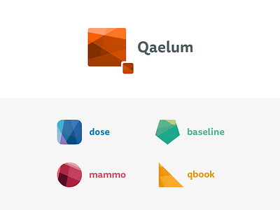
Qaelum - Medical logos
Although I rarely do branding work, I was challenged by Qaelum, a medical software company, to do a rework of both their existing branding and product logos.
The objective was to find a unique identity which aligns both the Qaelum branding in itself, as well as the individual products. Visually, it still had to be clear that it originates from the same company.
The result is a polygon logo resembling a Q, followed by a product line-up which has a similar polygon pattern, but uses different shapes and colours to present themselves.
View all tags
Posted on
Aug 12, 2016
More by Sven Lenaerts View profile
Like


