Lumi Sketch

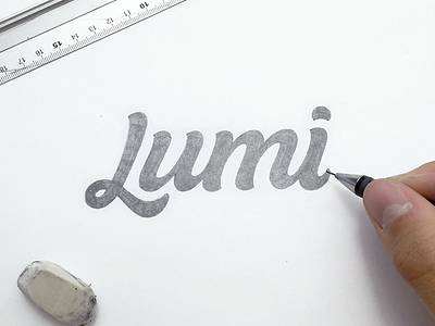

This is a concept project that I asked permission from Lumi to see If I can refresh and refine their logo as a portfolio piece. They said yes and so here is the final sketch before digital.
I set myself a list of goals I wanted to achieve and features that were highlighted when the current Lumi logo was released that I wanted to try and maintain.
It needed to be:
- Cursive
- Timeless
- Works well in all applications (Print, Web, etc)
- Usable in place with low vertical space (Menus)
- Simplified where possible, just as their service does.
- Reflect their High Quality Products and Service
I decided that I was going to increase the x height a little in order to make it feel a bit more natural and this will also help with creating a better flow.
I wanted to simplify the 'L' but not lose the all cursive properties
Make the Characters flow together so it’s less font-like and give the a more bespoke look
Finally during sketching I started create some versions with a nice slant and i’ve tried to give the logotype some movement as their service is to do with packaging I thought this was fitting.
I’ll have the digital version out next week, so be sure to look out for that.
In the mean time, any feedback is hugely appreciated.


