Thrive Grab Bar Co — Process

Thrive Grab Bar Co ( www.thrivegrabbarco.com ) is a brand trying to bring a youthful and positive outlook to those who are treated coldly or as sick people, through the installation of grab bars and other home improvements. They believe that no matter the age and condition, we all have the ability and right to feel secure and thrive.
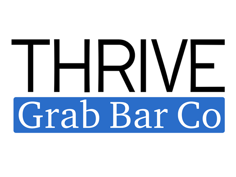
They were looking for a new logo that transmits their values: Clean, simple, confident, strong, respect, and optimism. With a target audience between 50 and 80 years old, a traditional yet clean and strong, reliable style was what we aimed for.
Through the design process, we avoided thin, brittle, or slanted styles, also leaving aside experimental and ornamental elements.
Some technical details...
Thrive was designed as a custom geometric font. It has a similar construction as many traditional styles, taking many aspects from Frutiger's construction of the fonts Méridien and Univers. Many illusions were corrected, the letters were made to look stronger with the addition of an inward curve in the verticals, and there are many other details for readability at the smallest sizes or the most difficult environments. I will upload a process shot for more detail on this.
Grab Bar Co is set using the font Charter. Chosen for its strong, yet traditional shapes, it adds details without being too fine or sharp.
To avoid looking too menacing or dangerous, a round and soft element was added: the blue bar. The complete logo is set in a rectangle, again, to demonstrate the strength and confidence of the brand.


