Take Action Now - Sketch

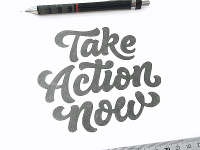

A little practice piece I'm doing on the side. I wanted to explore and learn how to out together better overall compositions as I don't get asked to do it often.
I think it's looking like there's some potential with this one as the balance is almost right just some inconsistencies in widths etc that need tidying up before I start to vectorise it.
I'd love to hear peoples thoughts. Let me know how to improve it and there's a high res version attached to look at. Any feedback would help me out, thanks!


