#11 Vertical Slide

Hey folks,
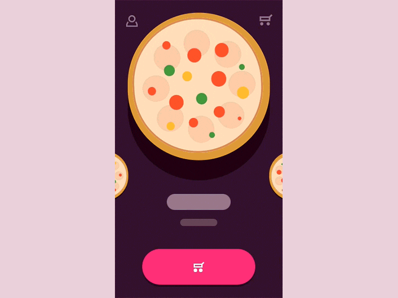
This idea of the look&feel is to keep user's focus on a tasty and juicy pictures of the items within the category and make your users come with their judgement depending primarily on those yummy looking pics within the carousel.
Navigation approach might seem a bit unusual (i figured the acceptable maximum of categories should be about five to keep it usable) and so i'd love to hear your thoughts on it.
I had a similar shot before but as i used a real pictures i couldn't fit an acceptable gif size limit to show you more interactions. Luckily the lowF approach allowed me to include more juice :)
Some processual thoughts on creating this and my other works is covered here, so you are welcome to check it out.
This shot is a part of so called interaction library, launch of which's been announced at my previous post.
Interaction library would aim a few main targets:
- Quick access to the example of a generic interaction you can quickly share with your client to get a reference point on the table;
- It’s easy to select and implement a behaviour type that would be suitable for a particular project you work on, as i’ll try for them to serve a typical UX need;
- I will as well try to cover the most interesting and non-standard approaches to explore relatively fresh behaviours so we all stay mainstreamed and aware;
- I do love create nice and smooth interactions and so now i have a chance of doing that independently of the project i currently work on most of my time :)
P.s. Thanks for hitting "L" if you like it, this will tell me to keep designing more of it!


