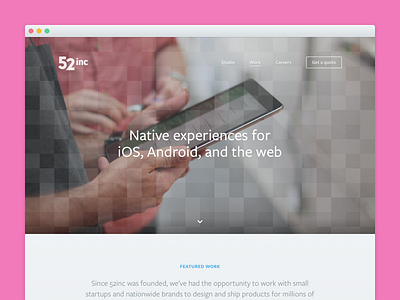
Work
This is part 3 of of the design process behind the new 52inc.com. Part 2 is here.
Our old site never really did our work justice. For each product, we displayed an image over a curt paragraph of text explaining the concept, but that's about it. For our new site, we wanted to put as much care into our product presentations as we do with the products themselves.
This time around, we did things differently. Instead of sending users to the App Store or Google Play, where imagery is often low res and reviews are one-sided, we now dedicate an entire page to each product. Rather than just showing screenshots, we focus on the humans that were involved in the design and development process. The first case study launched with the new site.
The one downside to taking a more studied approach to our presentations is that they're time-consuming to make. We initially planned on having six case studies ready by the time the site went live, but that was a bit ambitious.
On the other hand, it'll give us something to keep us busy in the coming months. 😁


