CrossFit icons

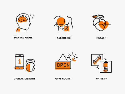
Hey guys! How's your weekend going? Recently we built a website for a crossfit facility and these are the icons I designed for the project. We wanted to create something bold but not brutal, fun but not childish :) There were a few iterations and style research and eventually we decided to go with this style the idea of which came from the screen printed art. Here we combined thick black linear icons with some elements filled with bright orange color.
I'll be posting more details from this project during the next week :)
----------------------------
Follow on Behance, Instagram, Twitter
Visit Plainwhite


