Twitter Logo Simplified

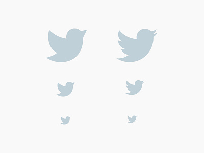
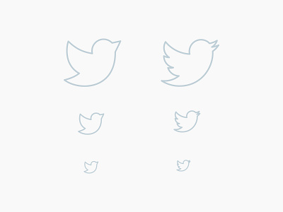
I was exploring stroke-only social media icons yesterday and ended up making this little guy after I discovered the Twitter logo just doesn't look right when it's not completely filled in, especially at smaller scales.
Attached is a comparison of the logo with the original so you can see what I mean.
Also, I'm not proposing they change their logo, by the way! I love Twitter's branding as it is. Just solving for a very specific scenario. Though, I do think such a change wouldn't be unheard of after Instagram's new stroke-only logo.


