Nasa Missions Screen

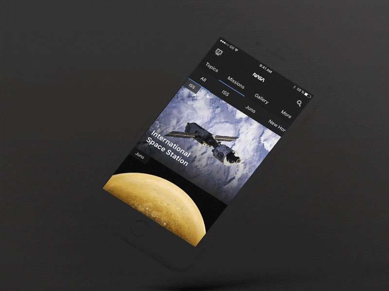


A couple of months ago I landed on nasa.gov's mobile view. I was actually quite confused, especially about the choice of navigation. The hamburger drop down menu, with dropdowns in it, felt super weird.The usage of a flexbox menu is a better choice (IMO) for navigation, as it gave me more space to split the Nasa TV and Search menus as main interactions of the mobile view. I'll upload more screens if you'd like to see them. I'm attaching a couple of screens bellow.
Cheers 👐


