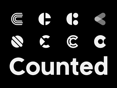
Counted Logo Variations
I'm looking for feedback!
This is a Personal Project I'm working on call Counted. It's a Simple Recipe Finder largely based around finding meals that fit into your remaining Macros for the Day.
A bit more background Info. For anyone not familiar Flexible Dieting (IIFYM) it is where you track you macronutrient intake, which determines how much you can eat, not what you eat. If you're strict about these you can often come to the last meal of the day and have to make them fit and this is a tool that will seach and suggest meals and foods for you. As flexible dieting is less strict that other dieting methods with what you can eat, I plan on making the UI a little less serious but very simple and easy to use. I needed to create an identity to match this.
I've created a simple Logotype and also 8 mark Variations which I need to decide on. To run through them I wanted to try and create a C shape by using 3 elements as there are 3 main Macronutrients, Fats, Carbs and Protein; so a lot will follow this aim. However one that's a little different is the last one, It's a Donut and a C combination and I think this could be a more fun way to identify the product. For me personally it's between the 3rd Top Row and the 4th Bottom Row as they have a more fun aesthetic that will work well along the simple type and the UI that I plan of designing.
None of this is final, they will all need tweaking once I have made a decision on which combination to use, so please let me know what you think.


