Lubalin Lettering
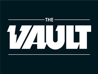
I wanted to see if I could sneak lightning in the negative space of a "V" for this logo. The weighting was all wrong on the left stroke and the letter needed some slab serifs to save the day and add need weight to the left stroke. I looked at Dynamo for inspiration, but the true secret was found in Lubalin Graph. Slabs facing into the letterform are a little shorter. This slight of hand was just what I needed to get the weighting feeling right on this one. Thank you Herb!
More by Alex Sheldon View profile
Like


