Split Shift v5

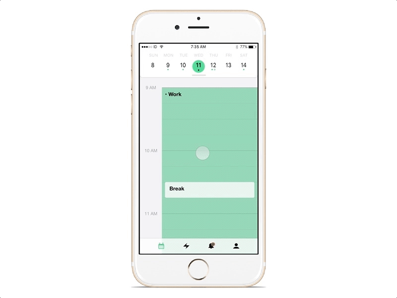


After testing the last view, I realized that most people, when splitting their schedule, needed to see their entire week in order to know how they should move work. (check out attachment v1 for that prototype).
However, this introduced quite a few problems, namely, that I didn't have a week view in this app... So I dug through some old sketches and found an idea I had for it, whipped it up, and presto! Week view!
Not so fast though, when I introduce other days into the equation, I also had to think about where they would move it to, and also had to restrict the placements. You can put it in the past, you can't add it to a shift that is already too long, and you can't add it to a day without work, if your selection is too short. Also, now I have to find out how to allow a user to select hour increments, but only from the ends of their shift. Requirements told me that we didn't want our users to select the middle of their schedule, so that was an interesting problem to solve.
But... as a result, I now had to also figure out how to make the user choose which end (start or end) of their shift they wanted to move. I thought I had a good idea for it (see v2) but the cells didn't feel right. Also the big (-) icons didn't convey the right idea. You're not deleting work, your moving it.
Then, I had a user tell me that they'd want to move their hours to different days. For example, if they removed 3 hours on Wednesday, maybe they'd want move 1 to Thursday and 2 to Friday. *head explode gif* Not an easy problem to solve, as you now have to make every hour selectable, as you don't know how many they'll put where. (v3)
Thank goodness for some clearer heads, who led me to the fact that just because 1 user asks for it, doesn't mean we need to support it as a core use case. The permutations of that flow would have been difficult (but not impossible) to solve. Tabled that for later, and further research. (v3)
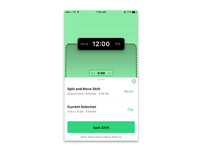
Enter v4, which was my last attempt to have all of the details summarized in that bottom sheet. It tested reasonably well, but I kept seeing people not noticing everything, or not reading the text. They could cut and paste just fine, but I realized that the context could give more information, and not burden the user with lots of text and descriptors. Also, in the version, I removed the 2 ends from the flow, instead asking the user to select 'edit start time' at the beginning, and then choose what type of edit they want to make. Small change, huge impact.
Finally, the v5, which is the main shot on this post came to be. I added those little bubbles, to show in context information, and added some iconography to convey better meaning. Tested really well. To give another option, there will also be a summary view (button on the bottom) for those users who want to review all the details before submitting their request.
All in all, I think it turned out well. All made in Principle.