Kit Homepage


After several months, and several scrapped directions, we finally rolled out the new homepage at Kit (Shopify's virtual employee app).
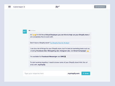
The design takes the important traditional components of a homepage (headline, description, value proposition, and CTAs) and converts it into a live conversation.
At the moment, the page only takes the input of a user's Shopify store, but eventually, it will transition to a more substantial conversation with multiple (but, obviously limited) inputs and responses that lead to an onboarding flow.
As for UI, the message bubbles animate into place (along with [...] typing symbols) at a speed that imitates a real person typing. i.e. the longer the bubble, the longer it takes to "write" and show up on the page (I did make sure no bubbles were too long and that long bodies of text were chucked apart) We also played with timing to make sure user can read the messages before the next one is sent.
I chose to make the conversation elements squarish and less bubbly to look more inline with the desktop UI. I also went full-width with all 'bubbles' to make best use of all the space available on desktop without blowing up size of text too much.


