Kerem Suer Monogram

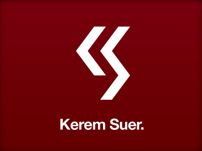


Kerem Suer and I got into a discussion on twitter about how we both didn't like to design with our initials. We were both convinced that each other's initials were better to design with, so we decided to design a monogram with each other's initials.
Kerem uses Helvetica on his website, so I started with what might pair well with the typeface. I wanted to pay a small homage to his birthplace of Turkey by choosing a white on red color scheme. I felt the stem of the K wasn't essential, and in doing so, the letters lent themselves to a military insignia epaulette-esque design.
There is a second monogram attached with two variations, one is a brush-stroke version, and the other is the same shape, but constructed from the letters in Helvetica.


